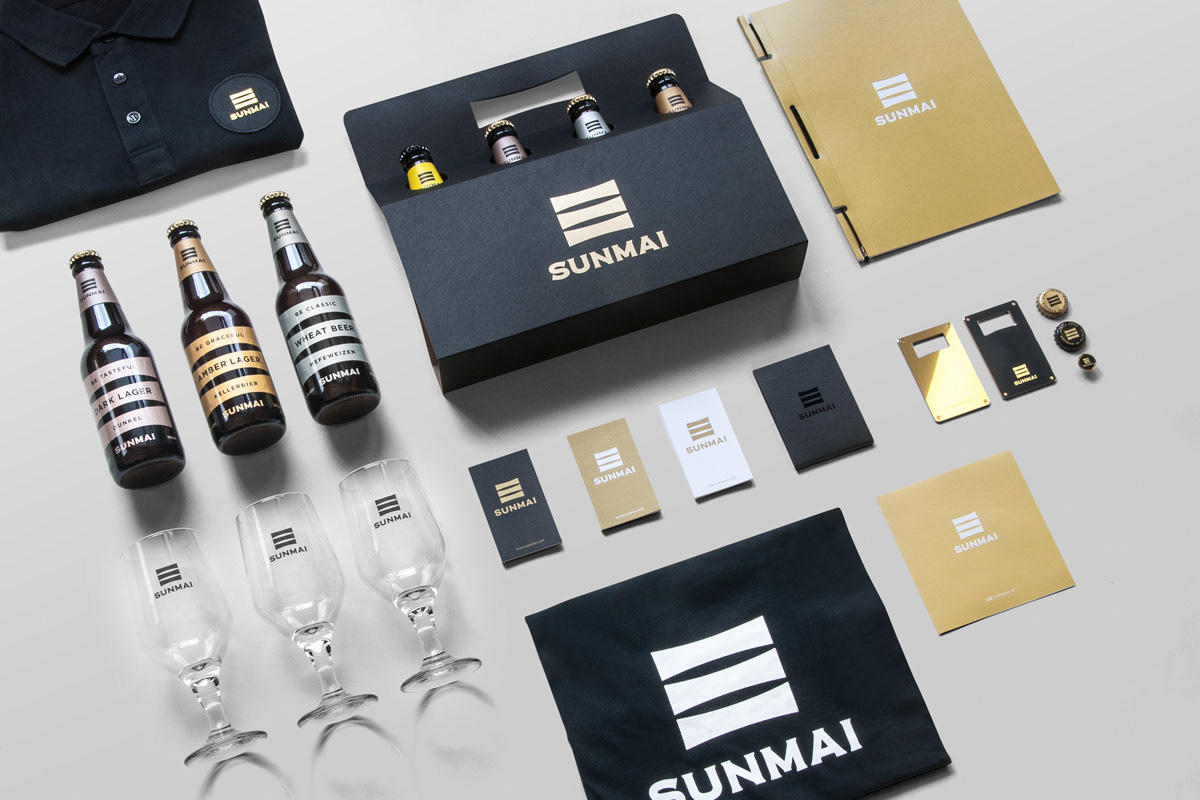
4 pack carrier and bottle opener designed by Huemon
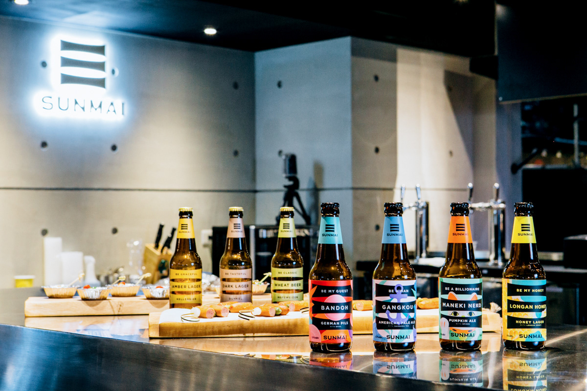
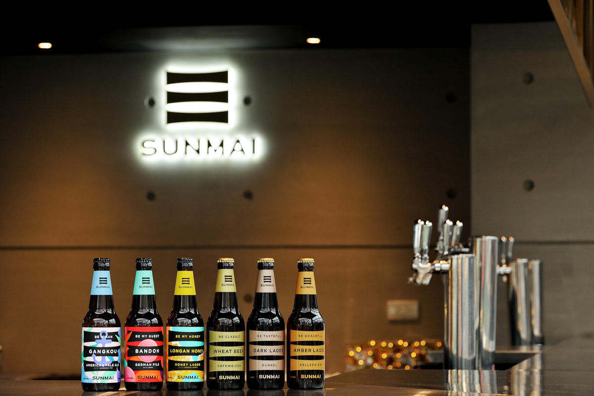
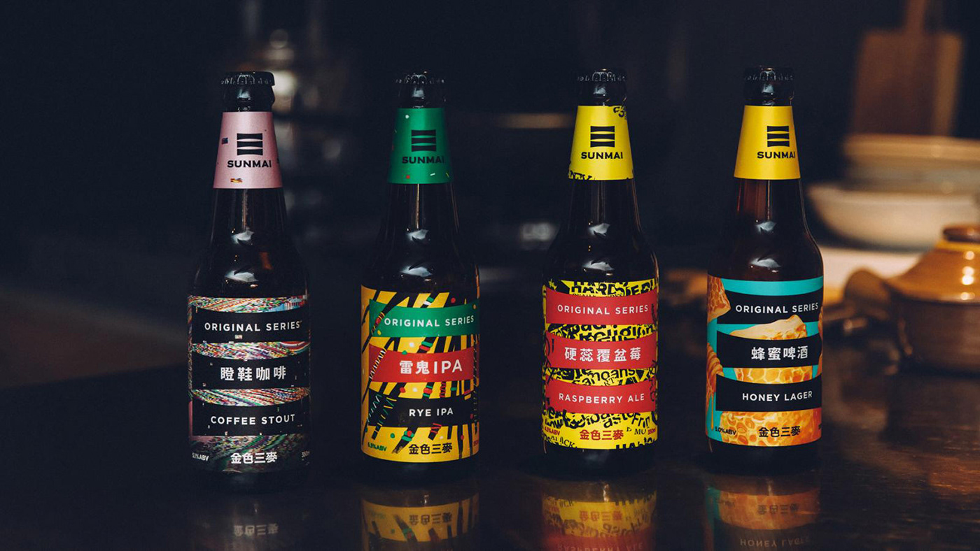
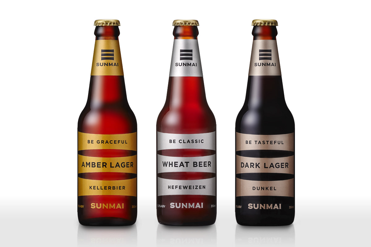
SUNMAI Brand Identity & Packaging
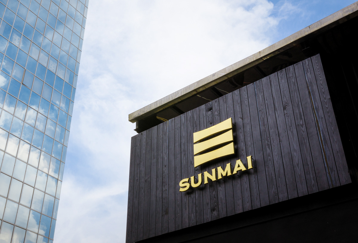
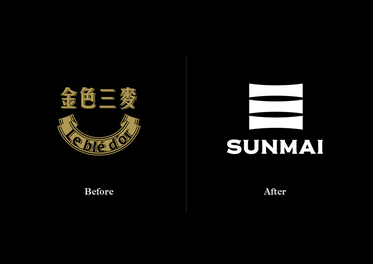
A rebranding project of “Le Blé D'or”, an award-winning Taiwanese craft beer company rename their brand as “SUNMAI”. Emphasizing on its Asian origin, a new brand identity is introduced with a mixture of contemporary design with a touch of German traditional craftsmanship.
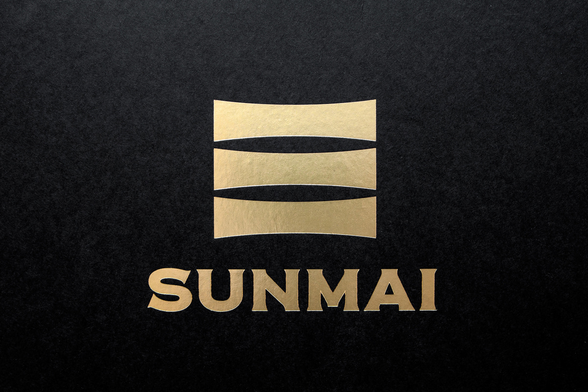
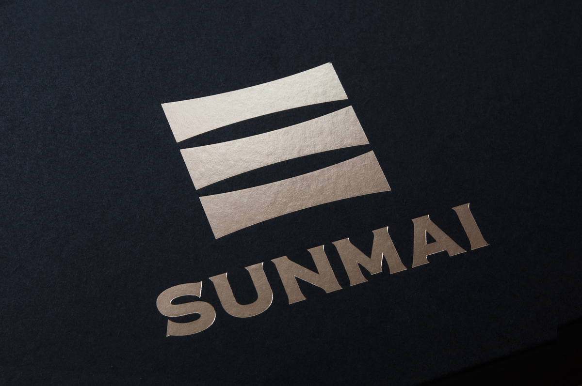
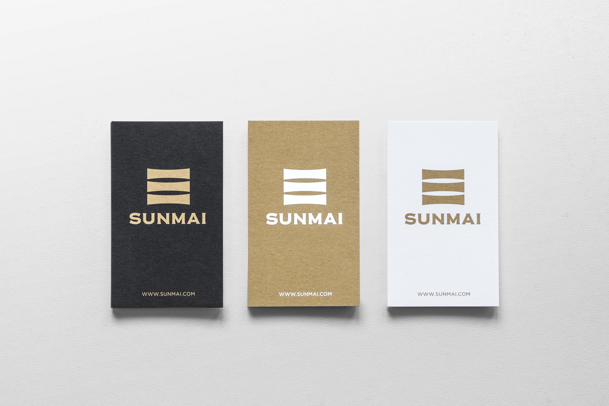
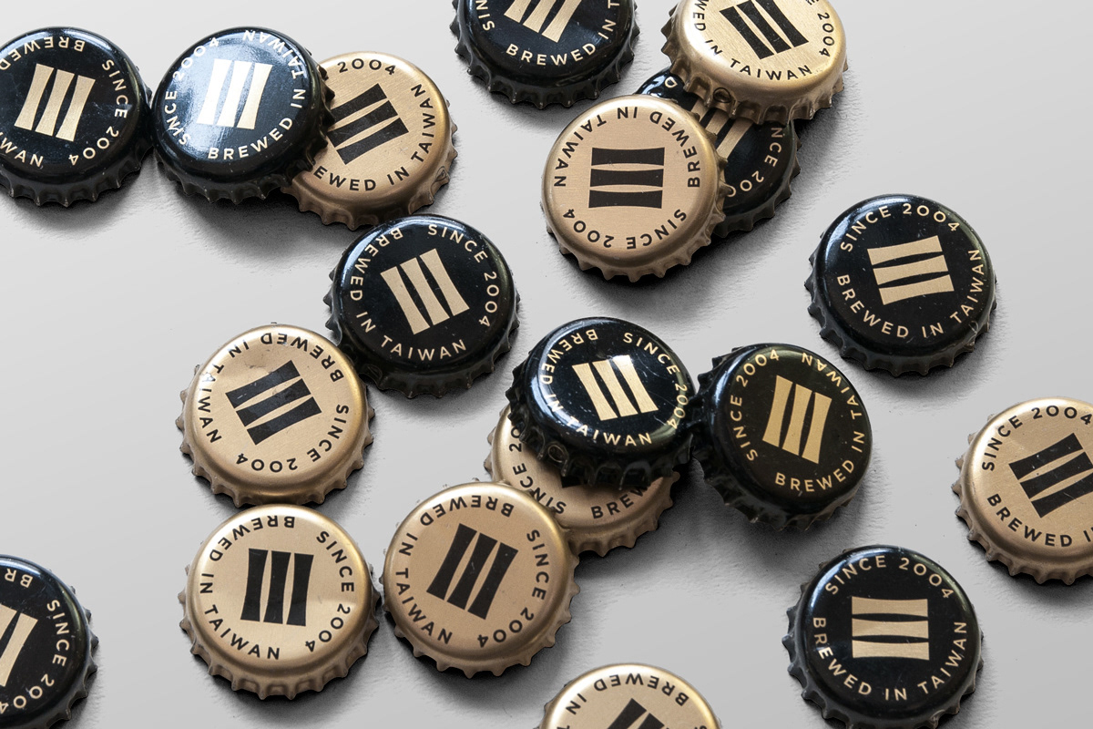
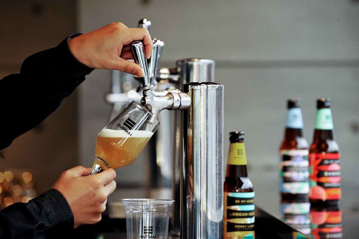
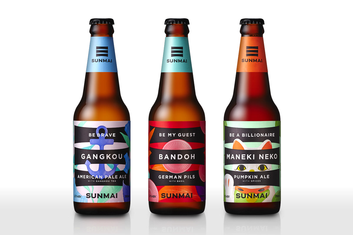
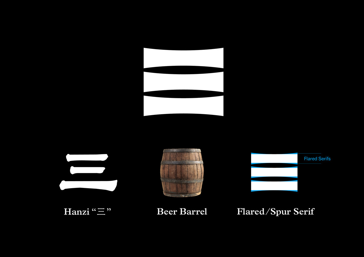
The new identity reinterpreting the Chinese hanzi character “three” (三) taken directly from their new name, representing the three main ingredients of the authentic beer brewing process, respectively Barley, Wheat, and Rye. We took the characteristics of the font style “Flared serif / Spur serif” in western typography and incorporate it into a Chinese hanzi character “3”, representing the European beer crafting tradition. Due to the simplicity of the logo mark, We also utilize the logo mark as a “container” in the beer label design to illustrate the stories behind each different flavors and ingredients.
SUNMAI 金色三麥
金色三麥原名 Le blé d'or,深耕台灣精釀啤酒文化超過 12 年,深獲多項國際比賽認可。這次的品牌再造計畫,以SUNMAI 英文名稱問市,重新描繪亞洲原創概念,其內涵論述納入了寬廣的混搭精神、濃郁的色彩氛圍、東方的時空觀念、雍容且中庸的質地、極簡的禪風意境、精緻的工藝精神、崇尚自然的原色原味…等等核心精神。以德國傳統啤酒釀造工藝為本,以新亞洲精神為質,以精釀在地口味的混搭創意職人為藝,面向國際市場,挑戰世界更挑戰自我。
新的 identity 以漢字「三」字為主要東方符碼,用聲音連結新品牌的英文發聲;用視覺「三」向金色三麥德式釀酒技術中的經典三款口味:小麥、大麥與黑麥致意,同時為橡木桶意象;用Typeface 將象徵德國傳統工藝的歐文字體結構融入設計,多重 DNA 排列與重組,演化出理型中的手工精釀啤酒新面貌。酒標表現以 identity 的線條作為 Container,依據不同的酒體、口味、顏色、原物料、故事與性格切入,概念與表現結合核心的亞洲原創精神內涵。除了在品飲時創造體驗之外,更延伸以視、聽、味、溫度、共同記憶…等等來溝通文化、在地食材與生活經驗,深化品牌層次、趣味感和記憶度。
Award
2018 - Red-Dot Design Award
2018 - DFA Design for Asia Awards, Bronze Award
2017 - Golden Pin Design Award
2017 - Taiwan International Graphic Design Award, Bronze Medal
2016 - Shopping Design Magazine Taiwan Best Design 100
2018 - Red-Dot Design Award
2018 - DFA Design for Asia Awards, Bronze Award
2017 - Golden Pin Design Award
2017 - Taiwan International Graphic Design Award, Bronze Medal
2016 - Shopping Design Magazine Taiwan Best Design 100