照片來源:上船了各位臉書
上船了各位!──人生幹大事
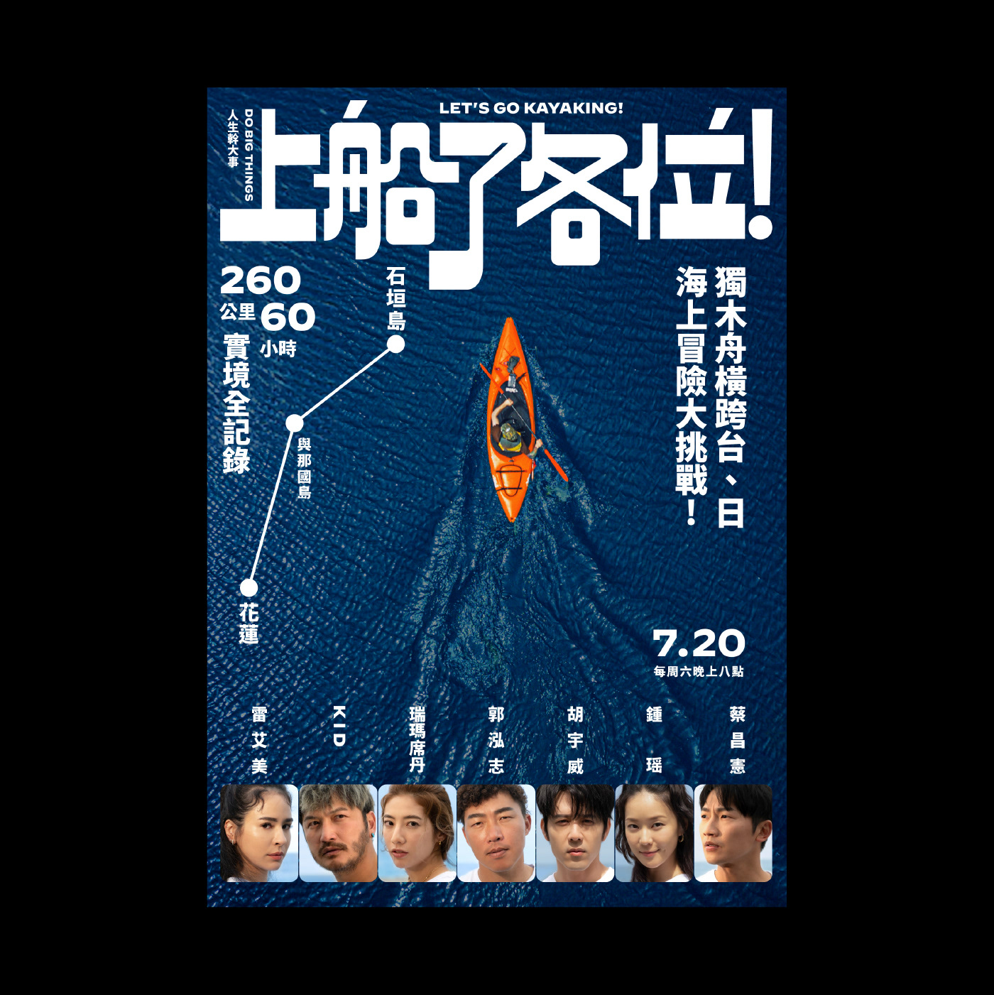
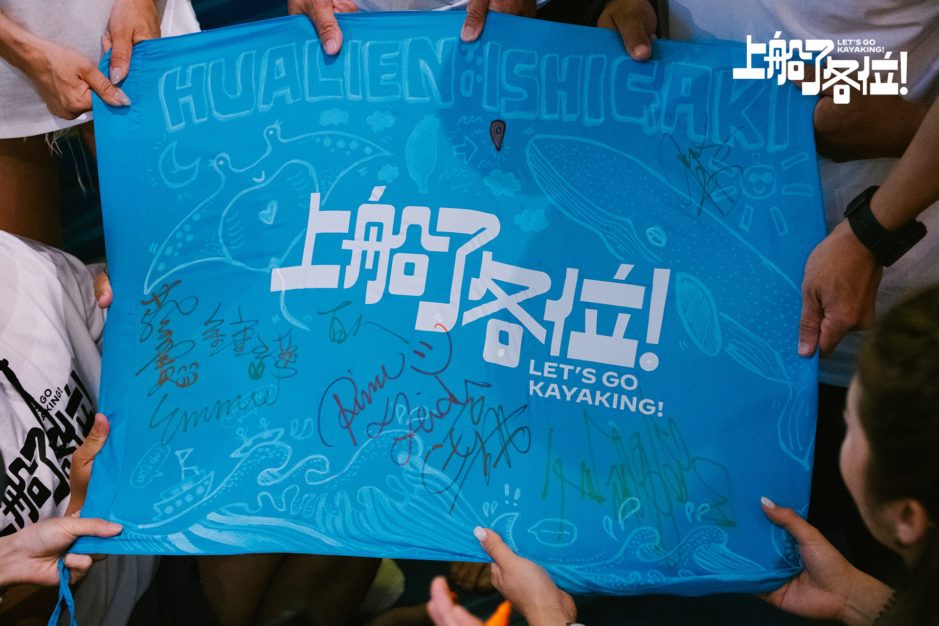
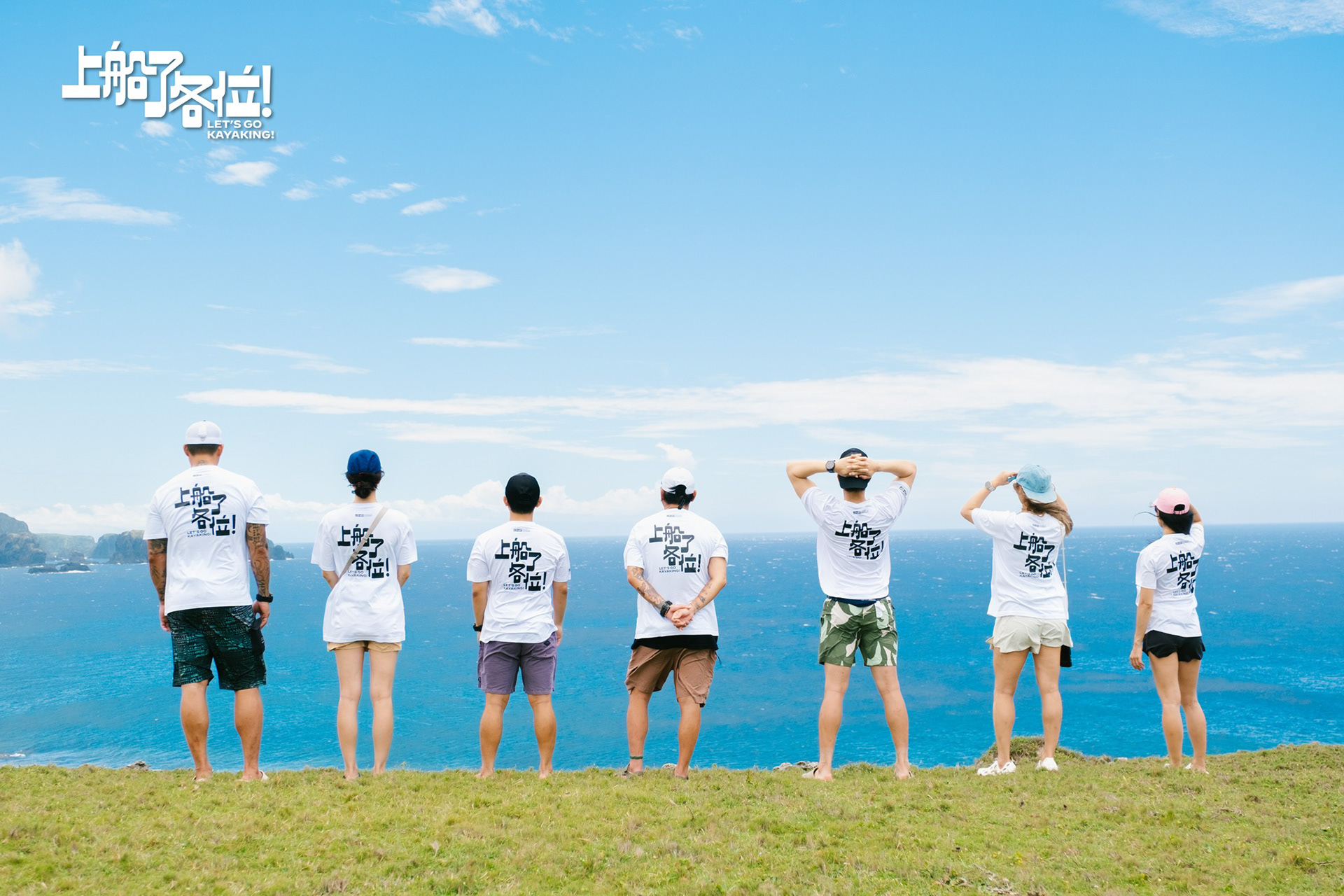
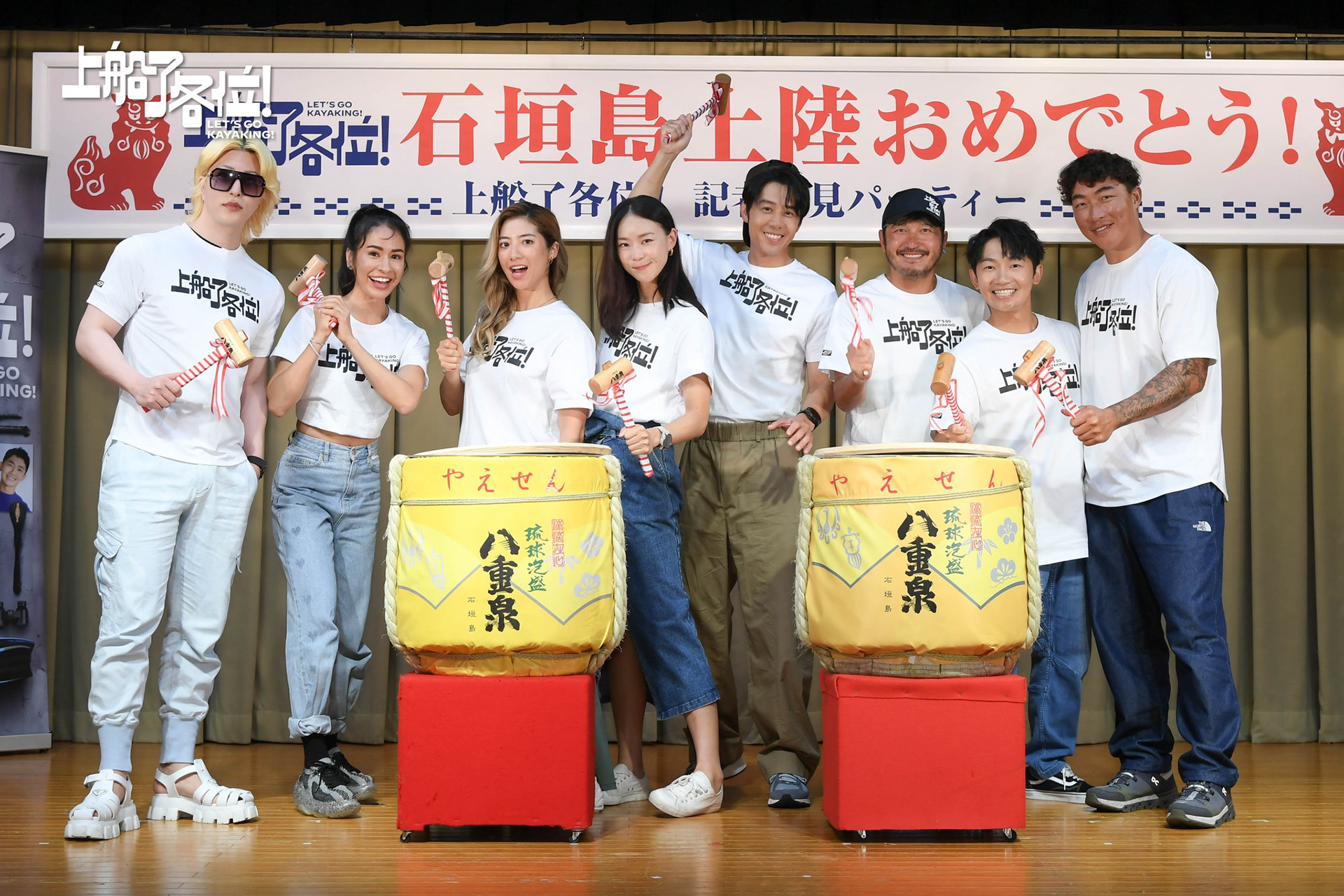
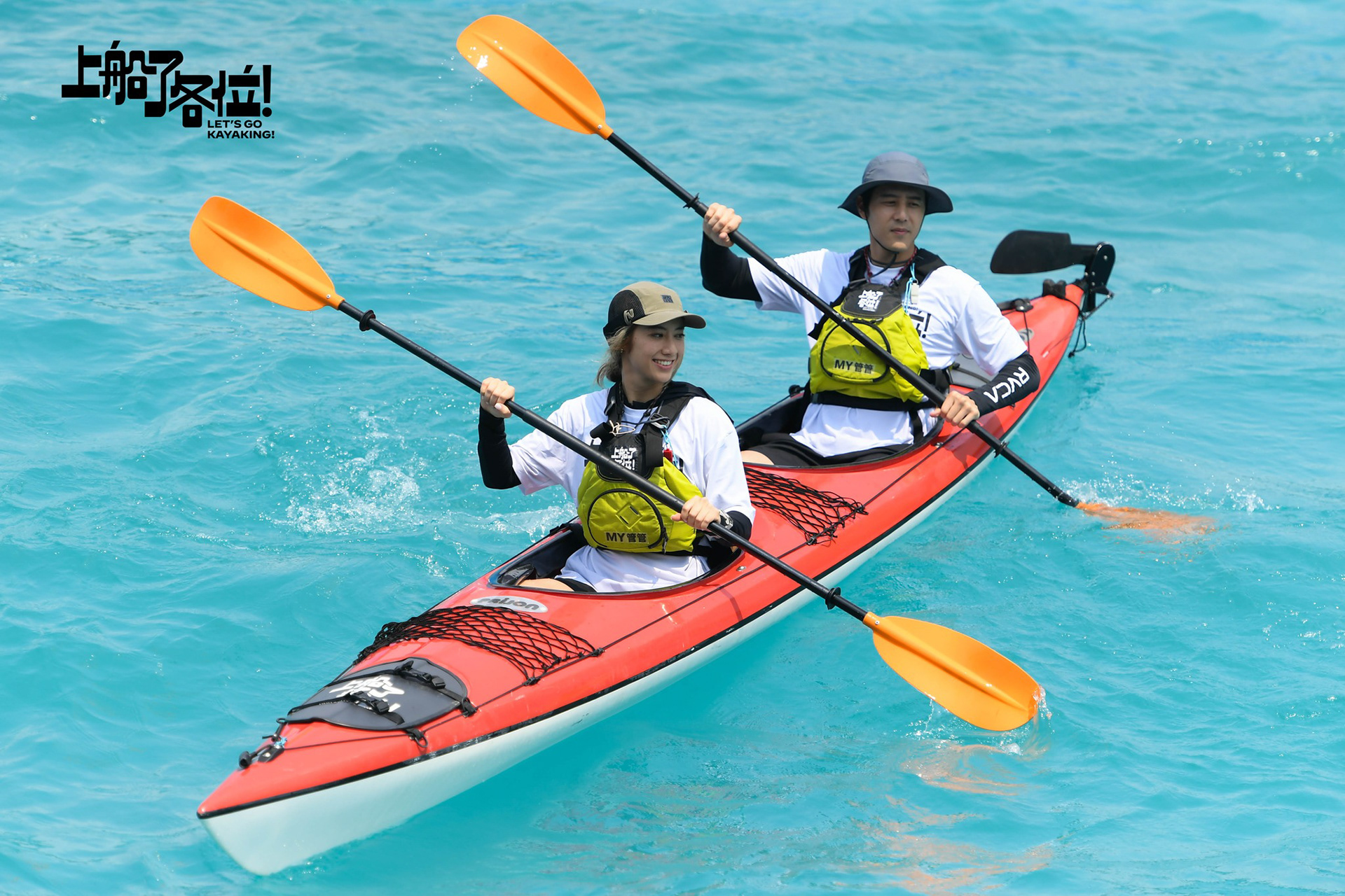
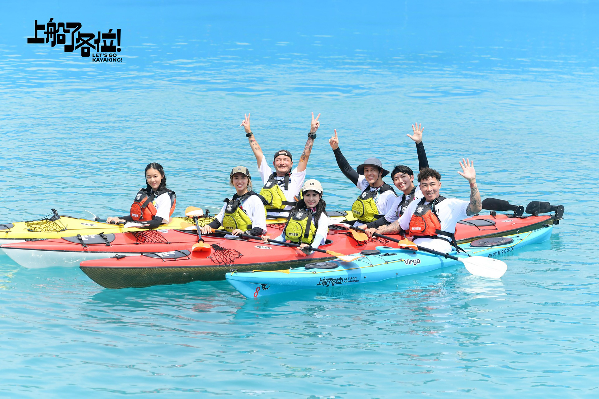
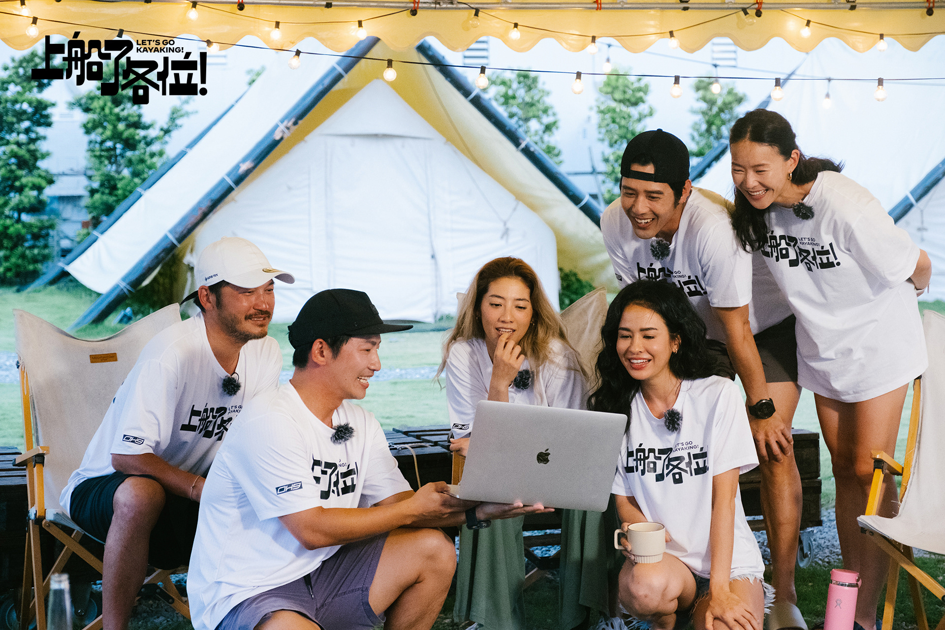
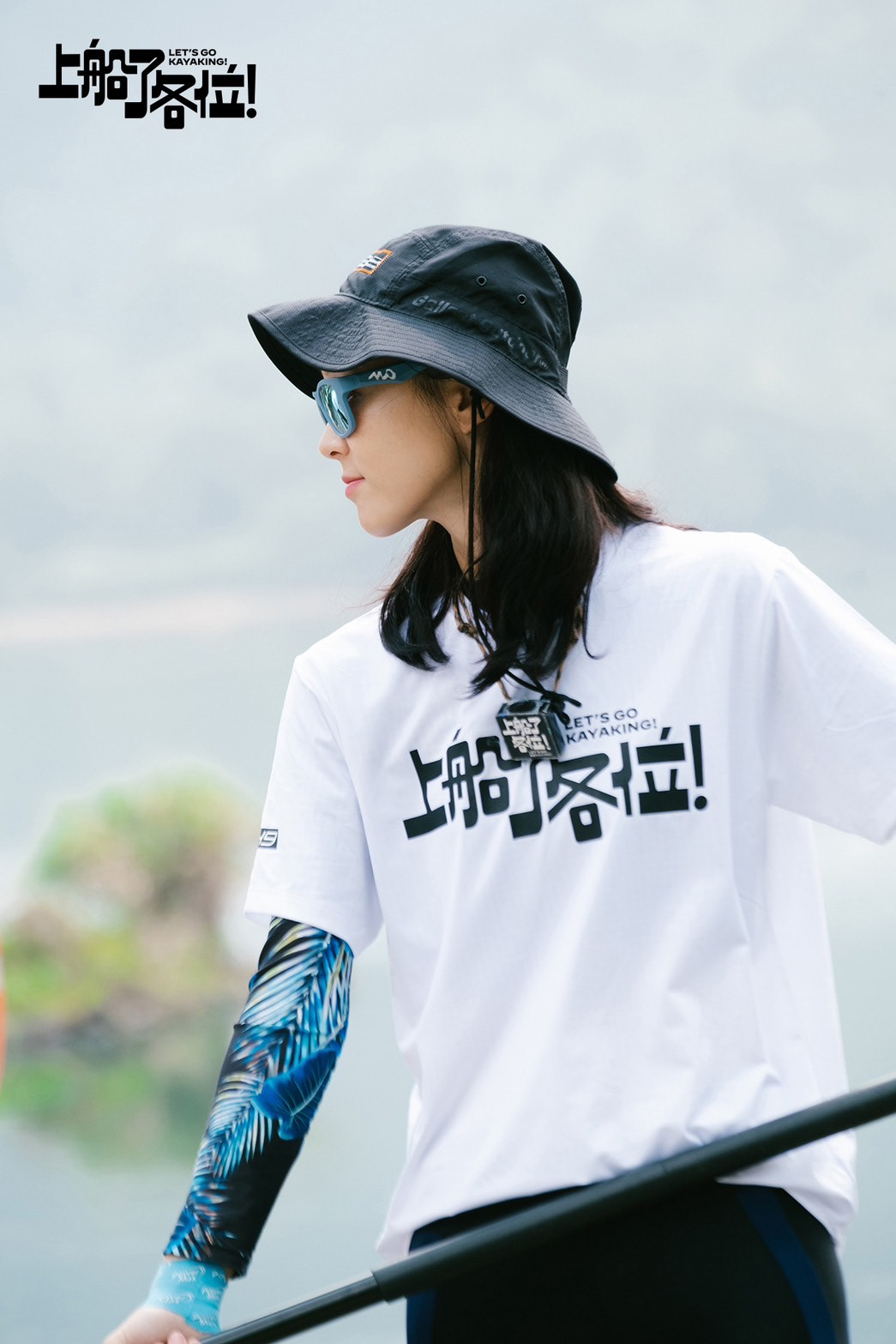
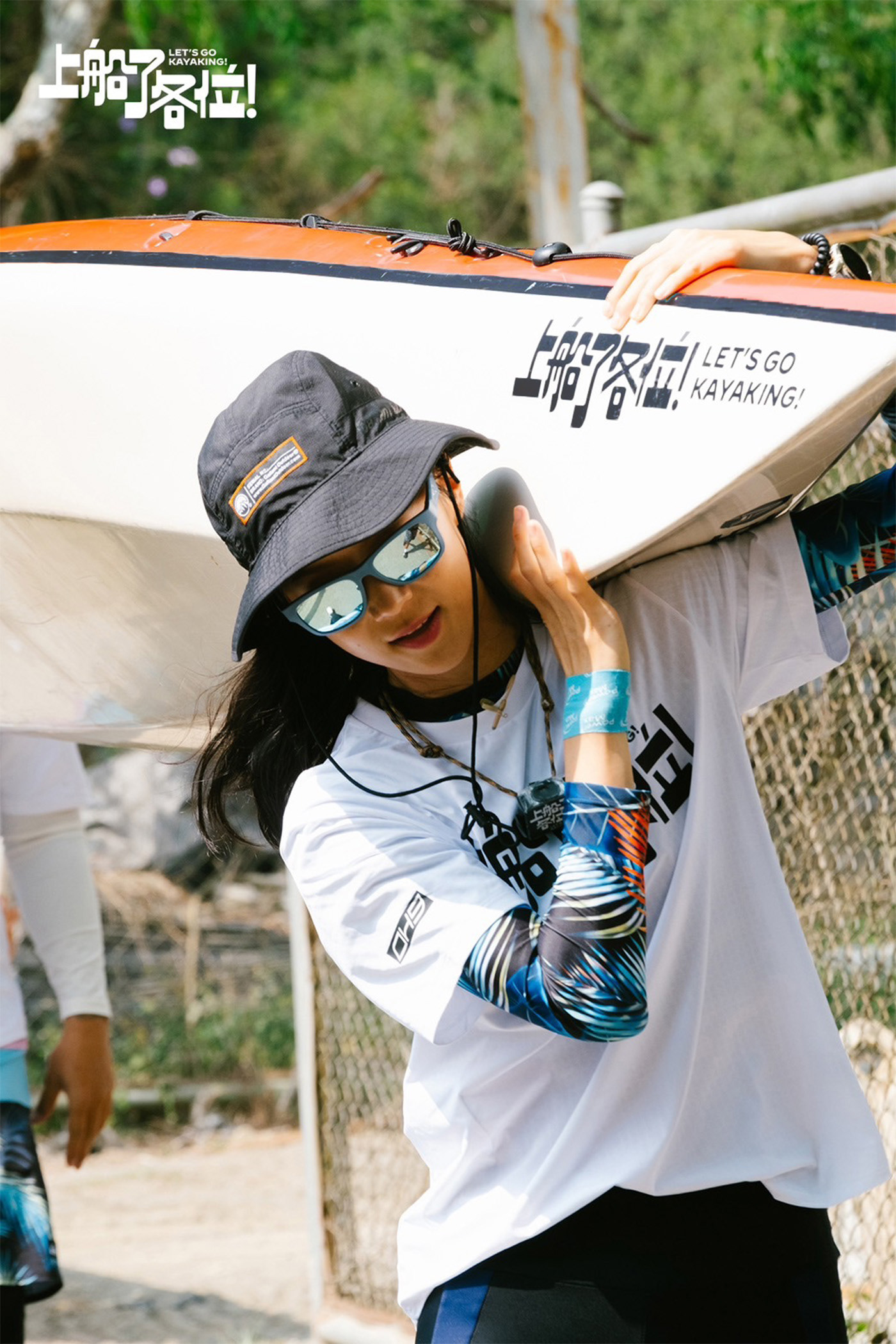
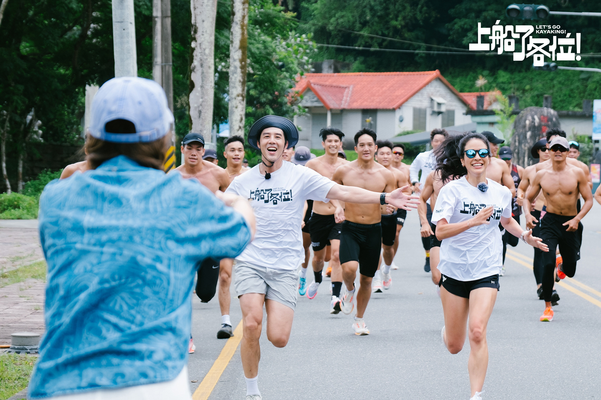
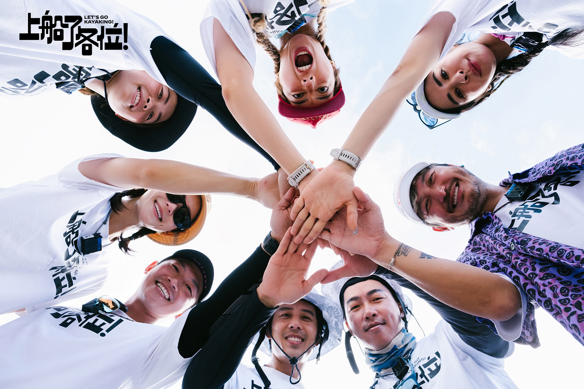
《上船了各位!》是一檔以海洋冒險為主題的實境節目,核心聚焦於獨木舟運動,展現挑戰自我的精神。七位藝人組成的冒險隊將從台灣花蓮出發,挑戰260公里的航程,直達日本石垣島。節目透過訓練和海洋中的探索,展現這群人如何以熱情與勇氣克服內心的障礙,互相扶持,挑戰極限,並在過程中尋找自我。
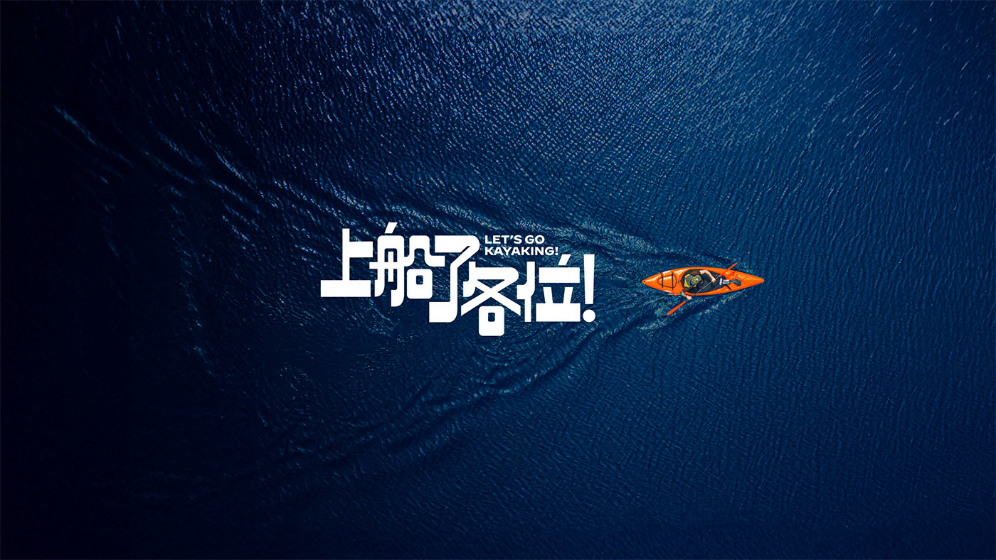
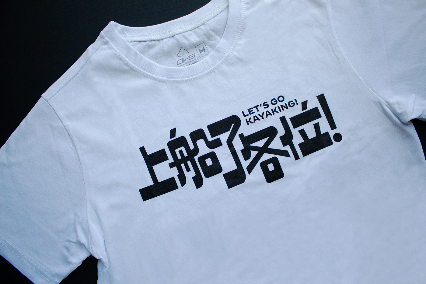
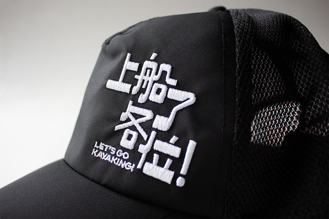
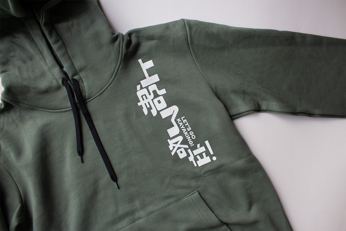
節目名稱《上船了各位!》屬於人生幹大事系列,核心理念包括挑戰、熱血、力量、極限與自我發現。標準字型採用「逆反差字體 Reverse Contrast」,其橫粗豎細的設計顛覆了觀者的視覺習慣,傳達出誇張、大膽與無畏的張力。字體中巧妙融入獨木舟和船槳的元素,強而有力的造型充分表達節目的價值與態度,形成與過程中複雜情感的對比。
主視覺透過空拍鏡頭呈現如同神的視角,展現無邊海洋中的獨木舟,突顯自然的壯闊與危險,以及人類的渺小與勇氣,強調了記錄片的實境感。特寫七位藝人的面部表情,捕捉他們對未知旅程的擔憂、興奮與期待,展現了真實而深刻的情感。
照片 → 三立電視 上船了各位!
動畫 → 二棲設計
Let's go Kayaking! - Do Big Thing
Let's Go Kayaking! is a reality show centered around ocean adventures, focusing on the spirit of kayaking and the challenge of self-discovery. A team of seven artists will embark from Hualien, Taiwan, to tackle a 260-kilometer journey to Ishigaki Island, Japan. Through training and exploration at sea, the show highlights how this group uses passion and courage to overcome personal obstacles, support each other, push their limits, and find themselves along the way.
The title Let's Go Kayaking! " is part of the Life's Big Adventures series, with core themes including challenge, enthusiasm and self-discovery. The typeface used is "Reverse Contrast," featuring bold horizontal and thin vertical elements that defy visual norms, conveying a sense of exaggeration, boldness, and fearlessness. Elements of kayaks and paddles are cleverly integrated into the font design, reflecting the show's values and attitude while contrasting with the complex emotions experienced during the journey.
The main visuals utilize aerial shots to create a god-like perspective, showcasing kayaks in the vast ocean and emphasizing nature's grandeur and danger, as well as human vulnerability and courage, underscoring the documentary's realism. Close-ups of the seven artists' faces capture their concerns, excitement, and anticipation for the unknown journey, portraying genuine and profound emotions.
Images → SETV Let's Go Kayaking
Animation → 27Design