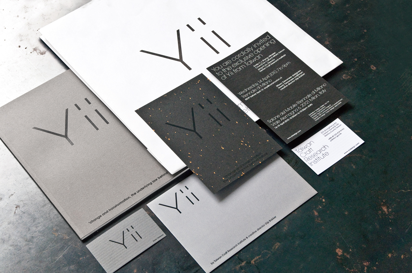
Yii - Brand identity
Collaboration with Creative Director Gijs Bakker
Collaboration with Creative Director Gijs Bakker
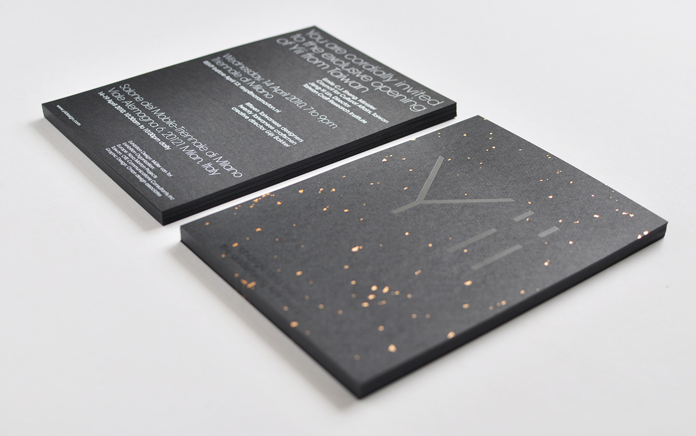
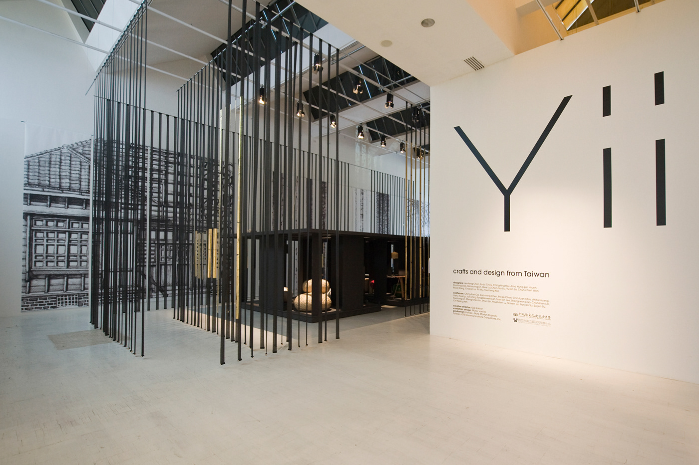
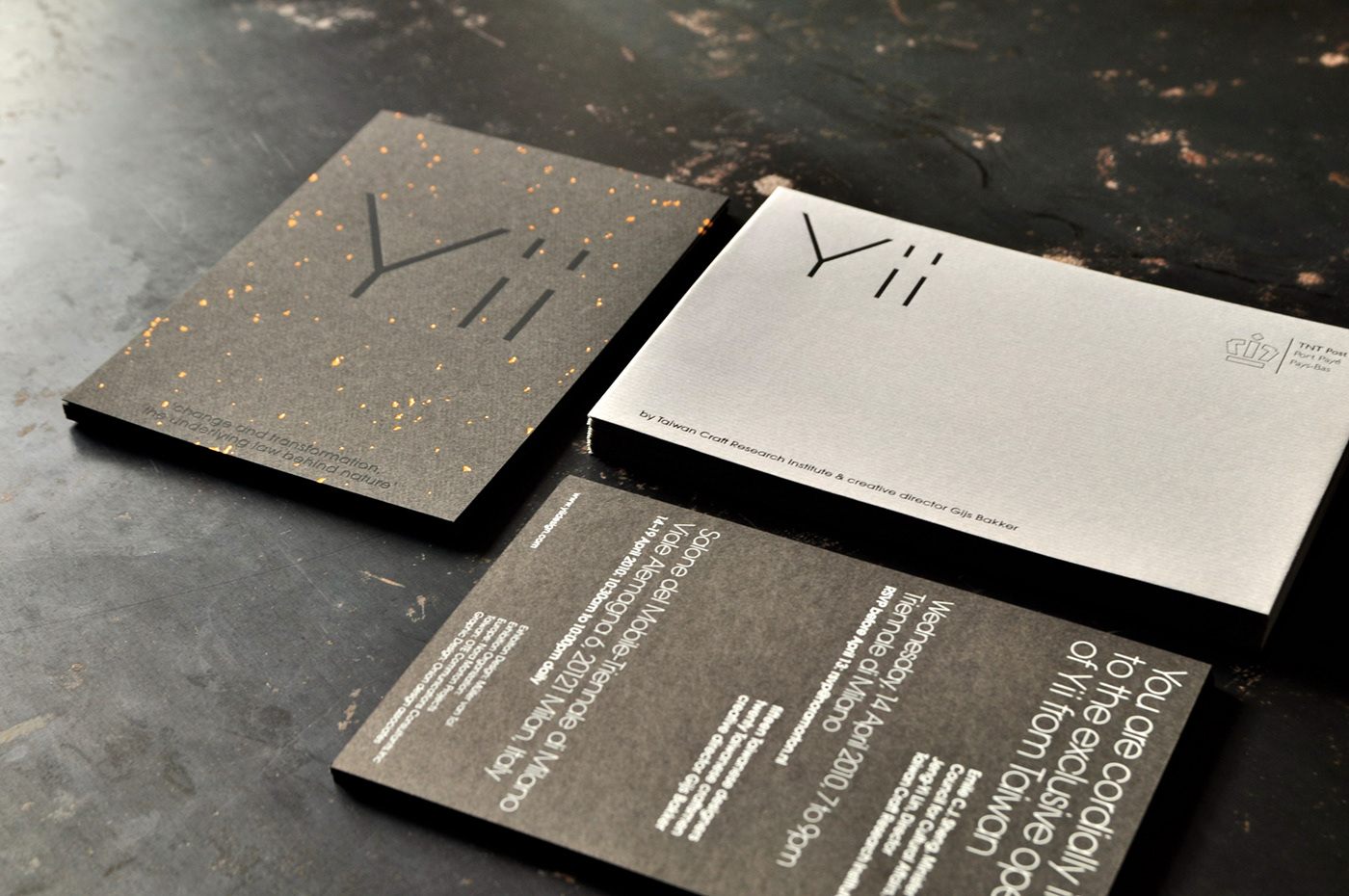
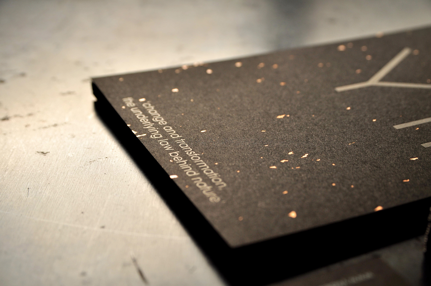
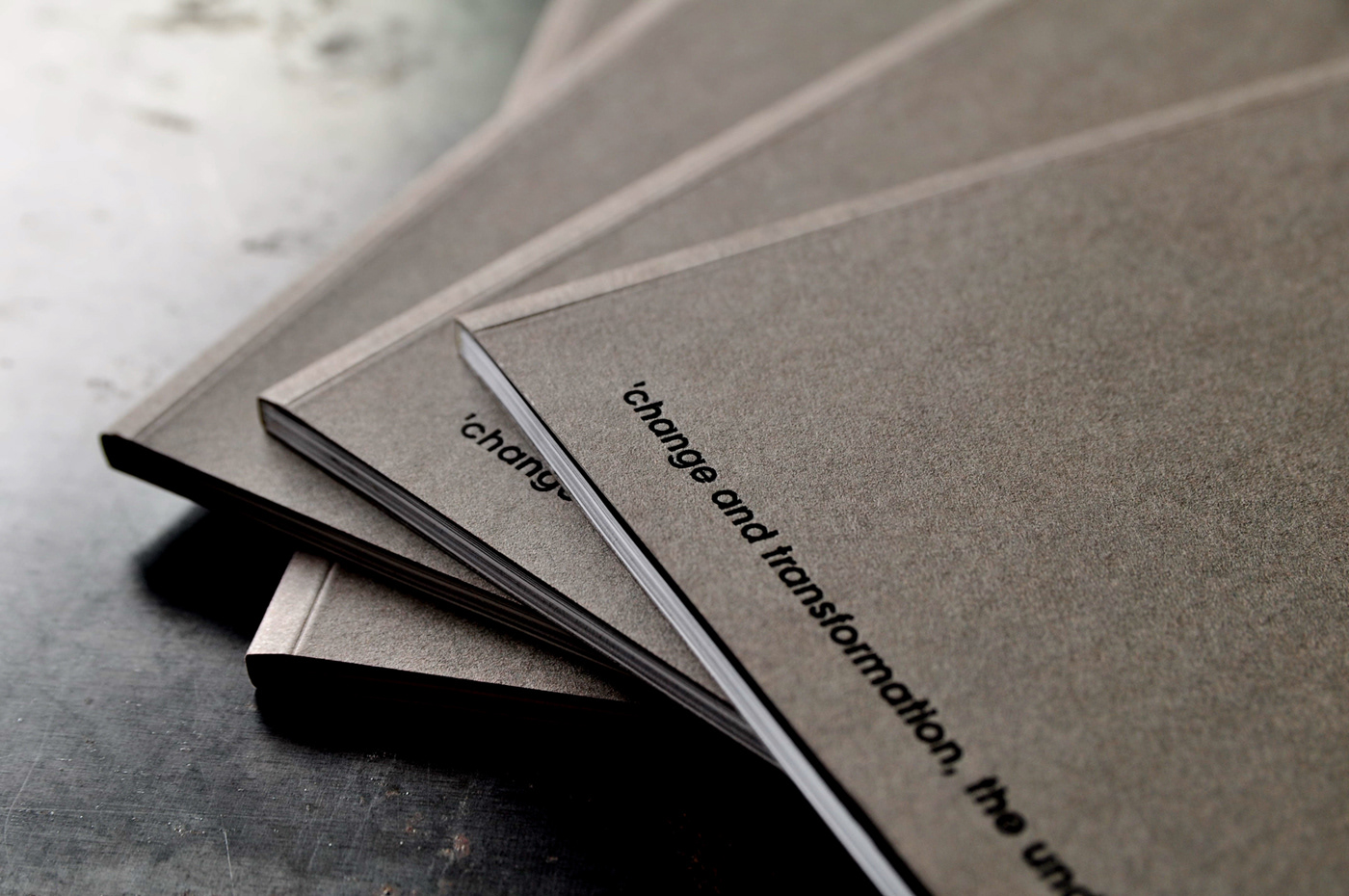
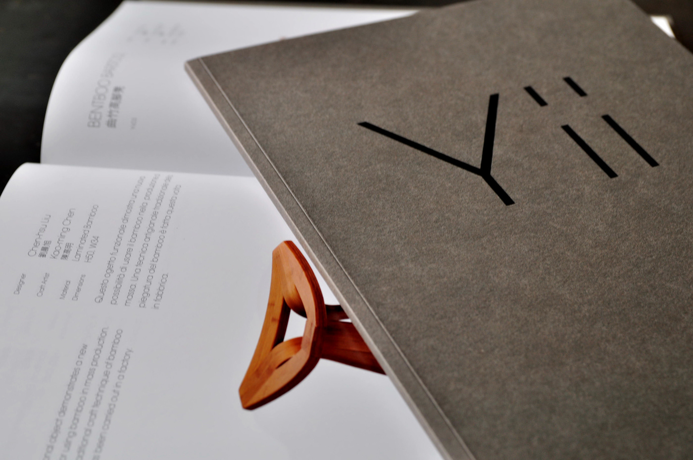
A very subtle and minimal brand Identity design commissioned by NTCRI (National Taiwan Craft Research Institute). Yii - a brand that bring together works of Taiwanese designers and traditional craftsmen. Opening at Triennale di Milano this year. Organized by Creative director Gijs Bakker.
The Concept
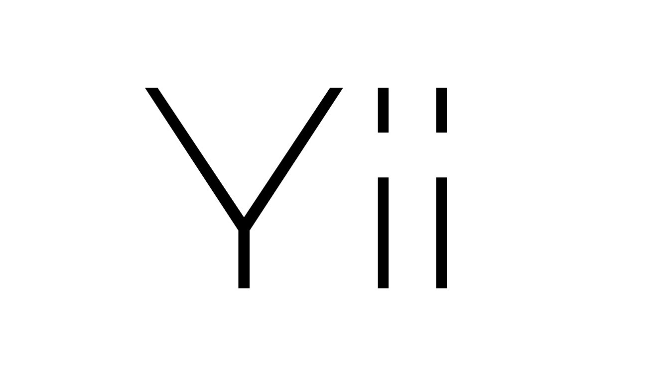
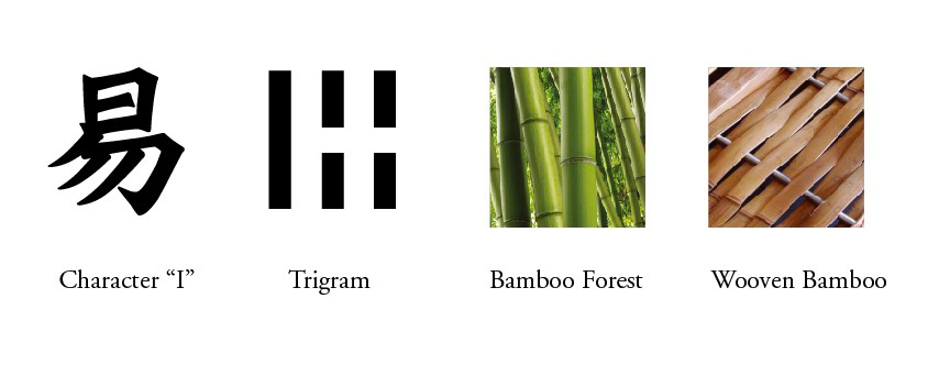
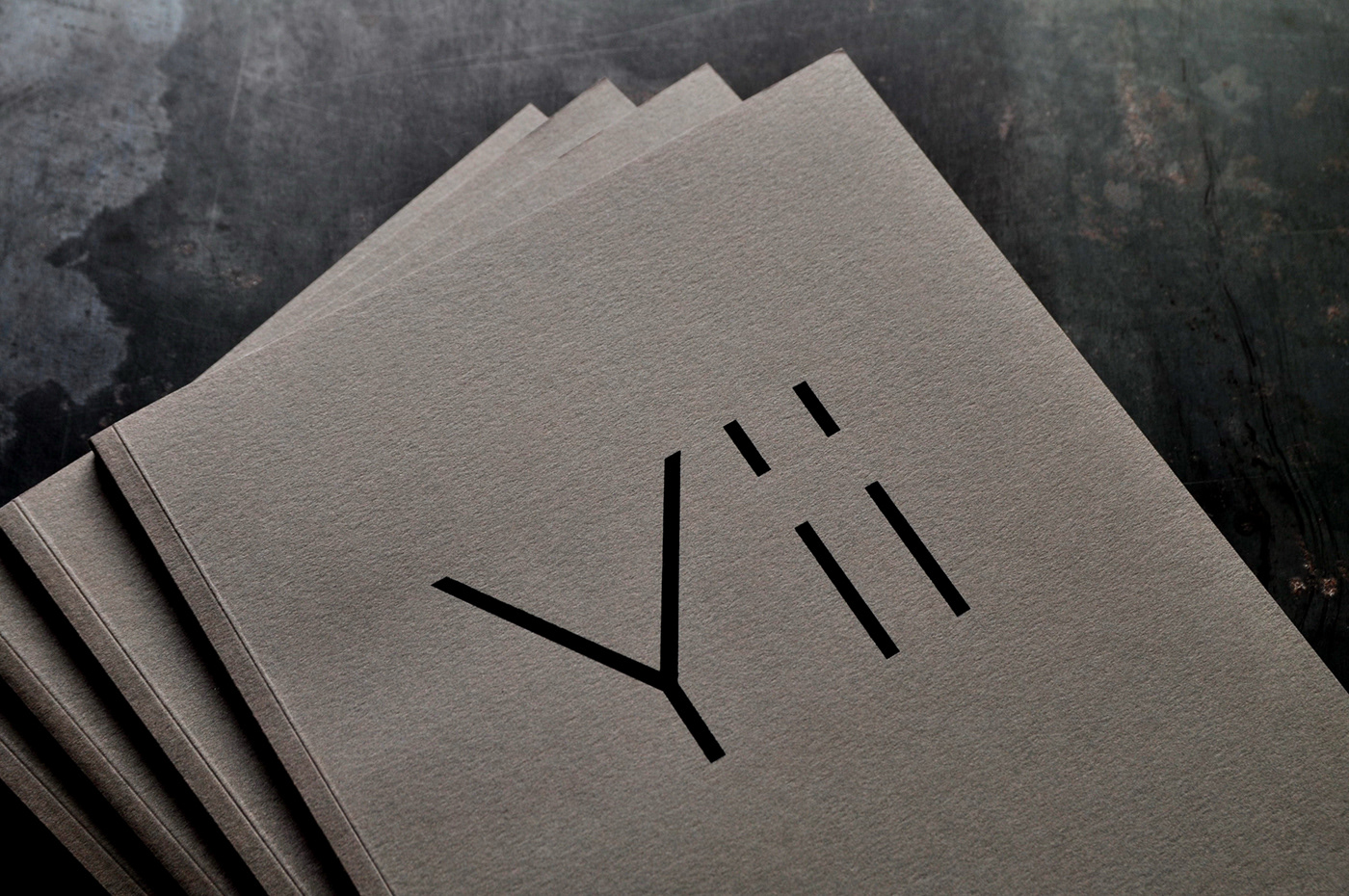
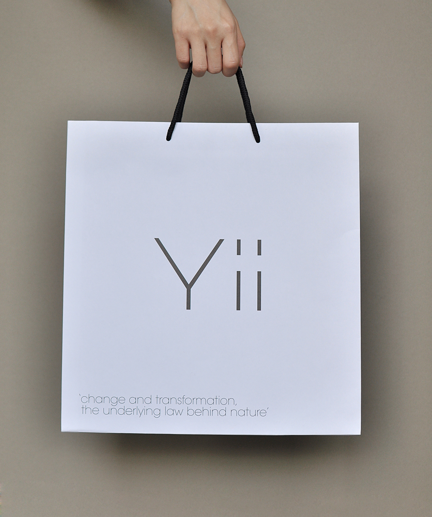
"Yii" (易) - pronounced as the letter E - Taking from the classic text I-Ching (易經) , also known as the Book of Changes. The logo mark design, as requested by creative director Gijs Bakker (co-founder of Droog Design) , need to be very simple and not looking too logo. We decided that a pure minimal typographic approach would work.
"Yii" (易) - pronounced as the letter E - Taking from the classic text I-Ching (易經) , also known as the Book of Changes. The logo mark design, as requested by creative director Gijs Bakker (co-founder of Droog Design) , need to be very simple and not looking too logo. We decided that a pure minimal typographic approach would work.
Avant Garde extra light was selected for its geometrical simplicity. We modified the strokes and spacing as a subtle reference to a Trigram marking from the bāguà (八卦) symbol; mimicking one of the eight possible trigrams of the I-Ching, ☶ (The solid line represents yang. The open line represents yin).
The thin lines composition also works as providing a reference to Bamboo, a local grown eco-friendly material and is frequency used by Taiwanese craftsmen.
Please visit http://yii.ntcri.gov.tw for more information.