


第 58 屆金鐘獎
Collision 碰撞
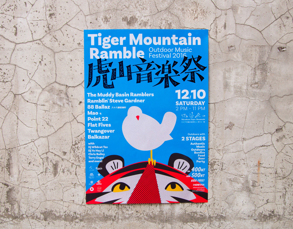
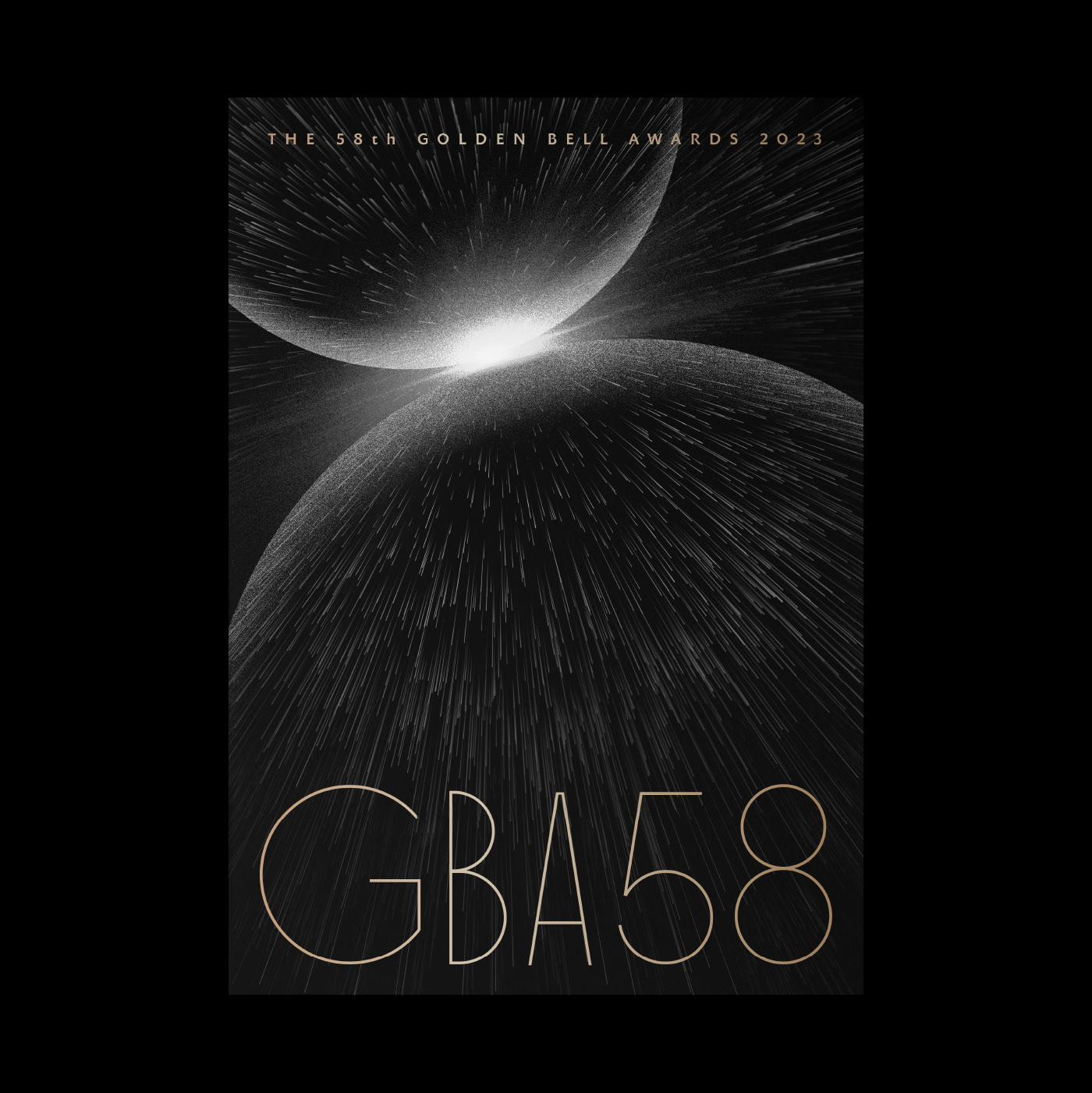
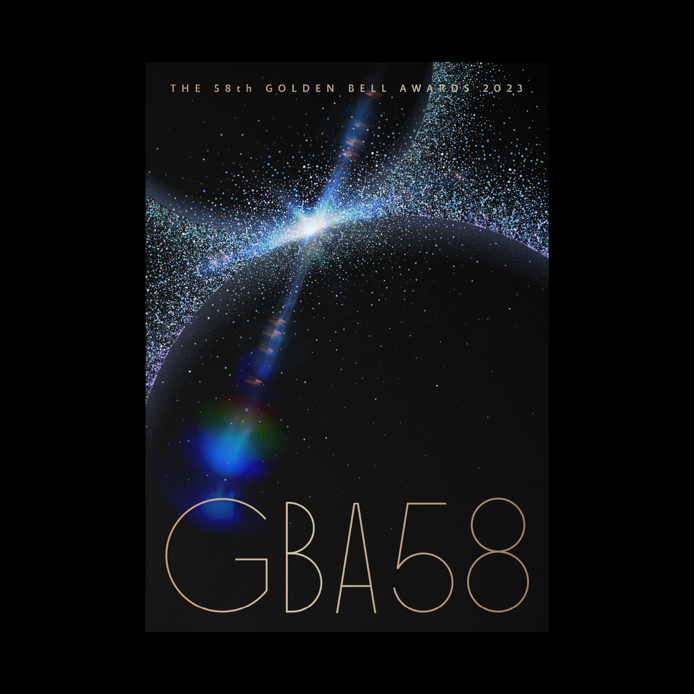
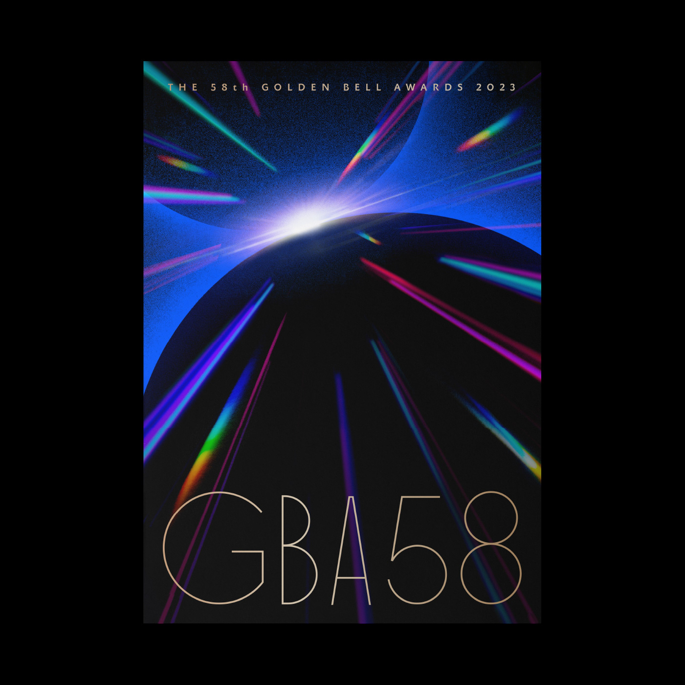
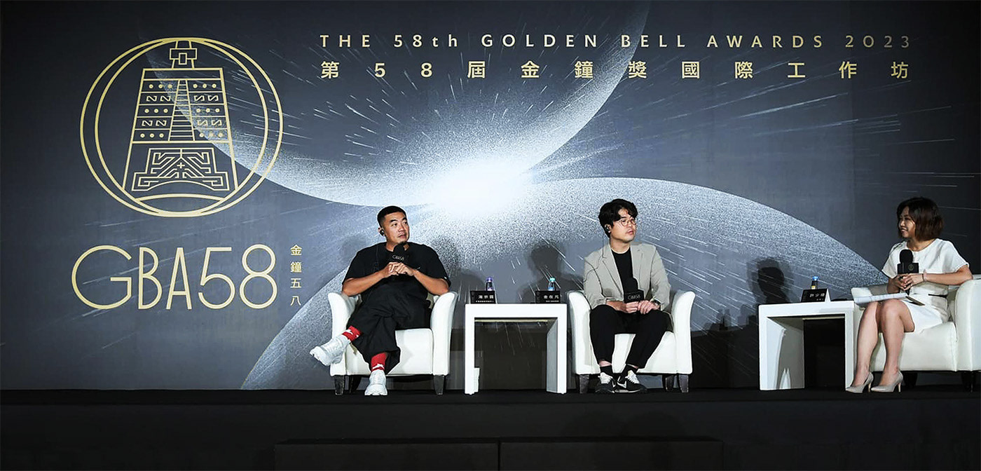
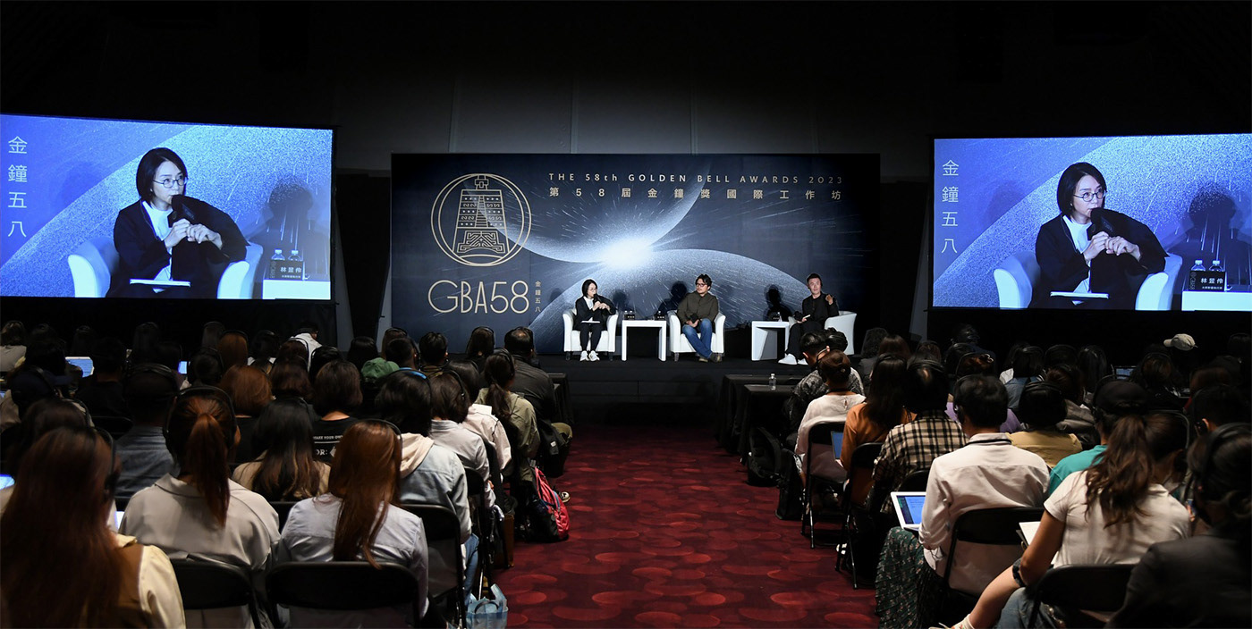
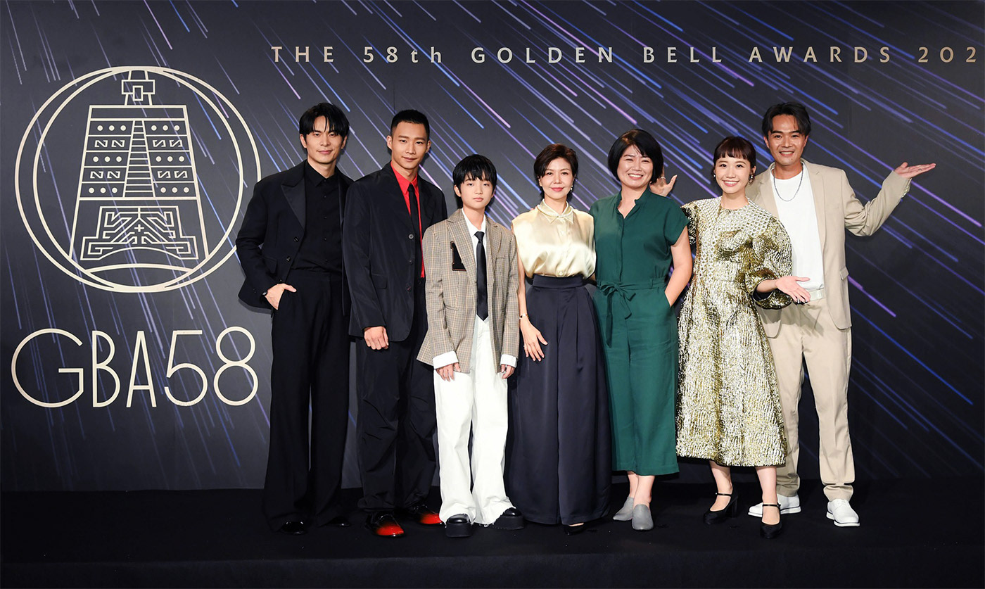
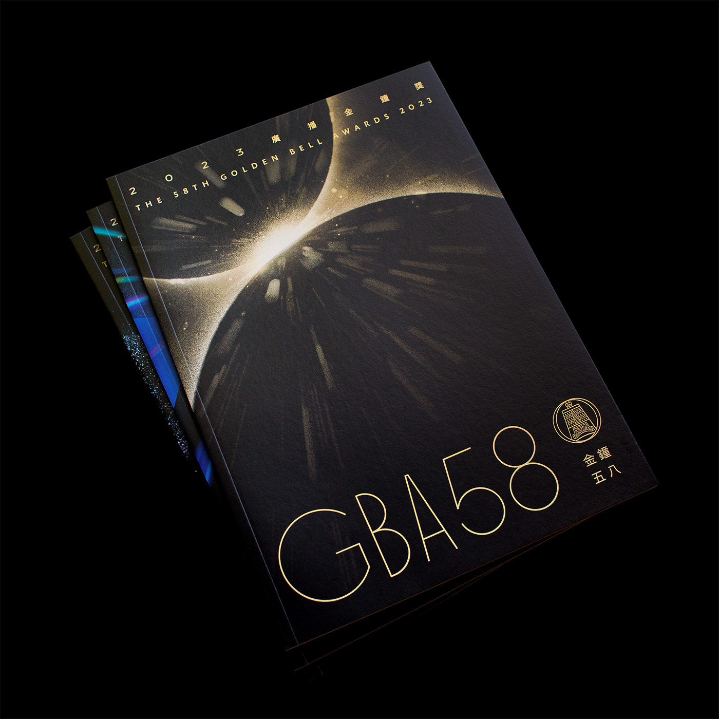
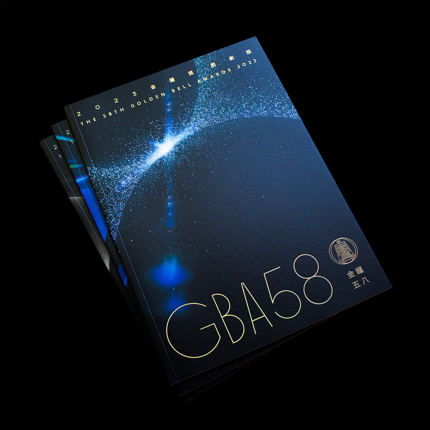
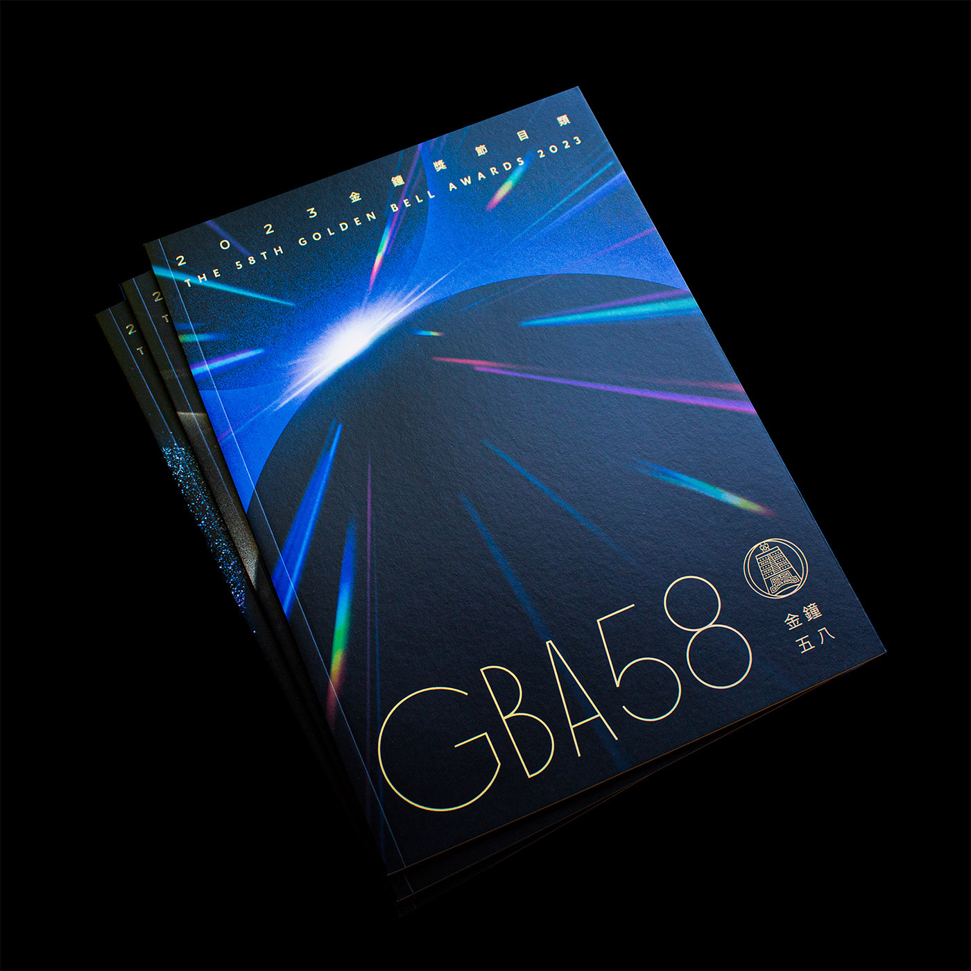
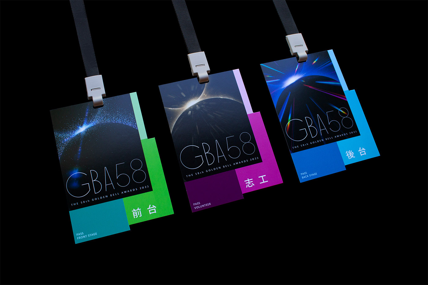
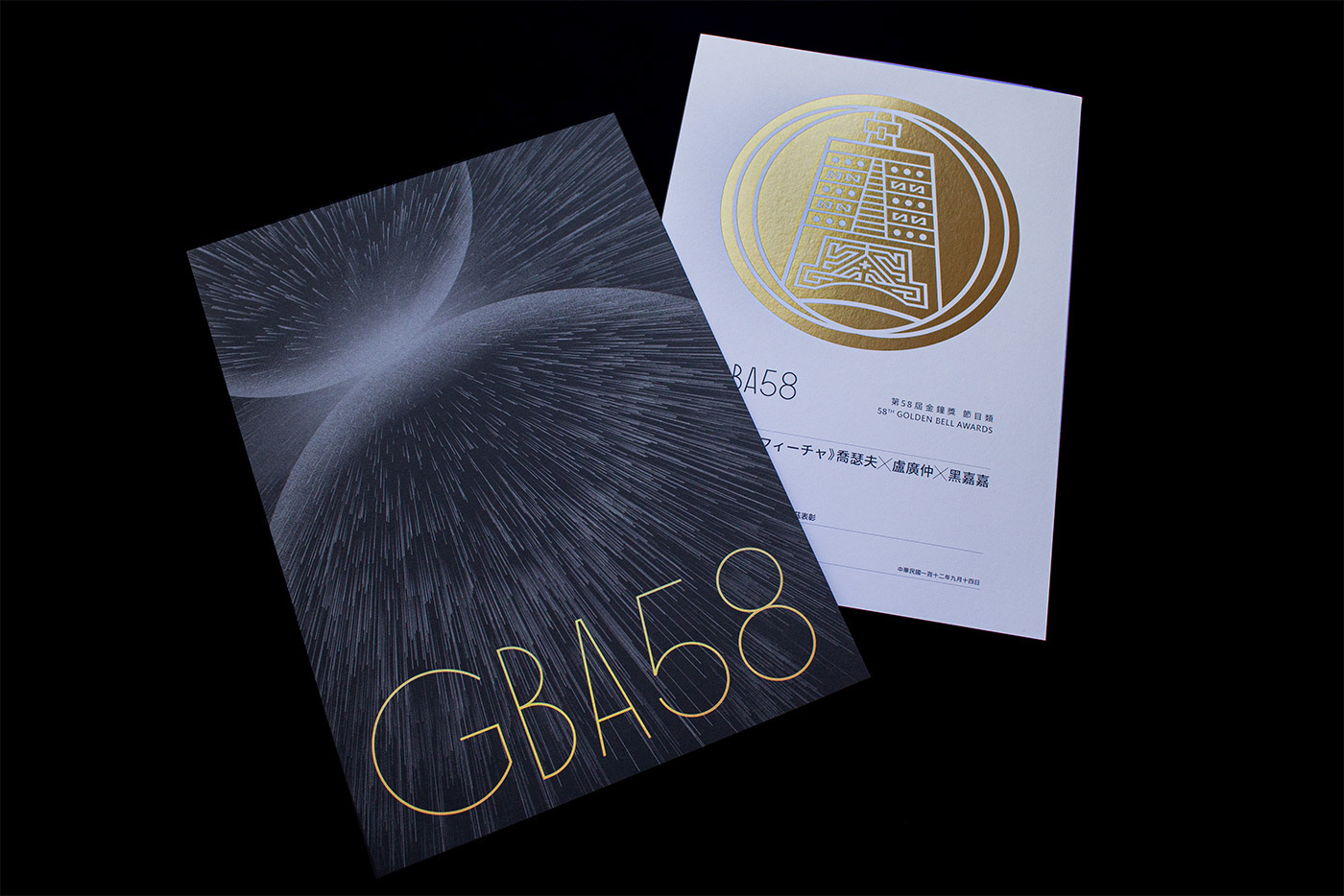
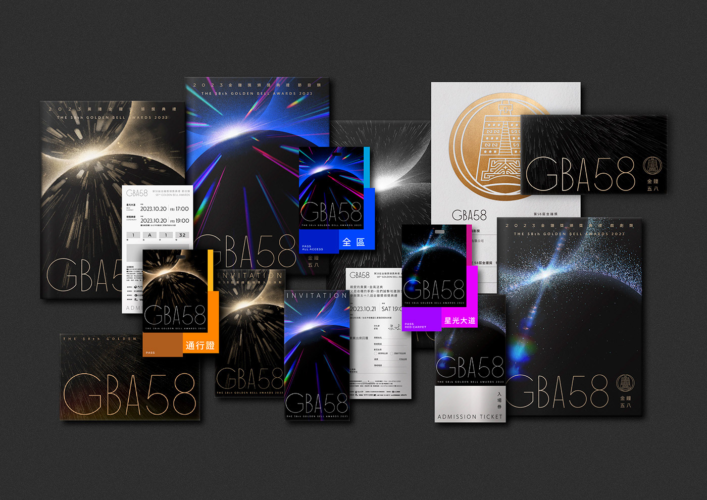
延續第 57 屆金鐘獎主題「流」後, 外在環境持續開合轉變、平台串流齊放,產業迎來更多的機會與變數;疫情與戰爭未歇,理想與落實、突破與維運、供給與需求、生活與生存,各種調校將加倍加速,也更迫切契合著人心之所向,多維碰撞、應變與落地將是下一課題。 視覺以雙圓碰撞為基本型,用特寫鏡頭對準碰撞爆發的一瞬間,從 0 到 8 、從無到無限、從靜到碰撞發聲的氣勢徬礡,界線被模糊反置,在新舊翻轉間創造迸發。
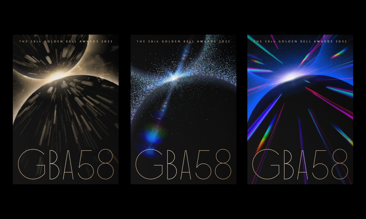
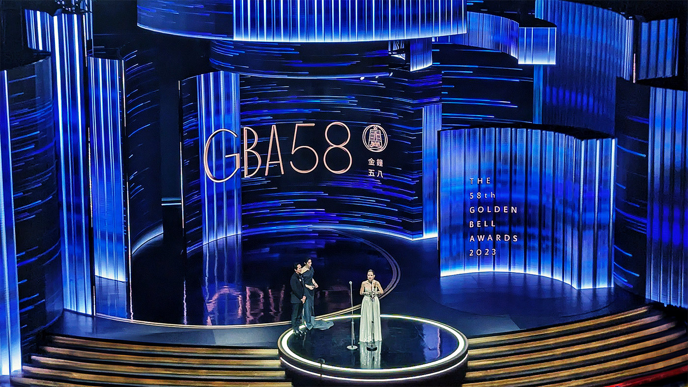
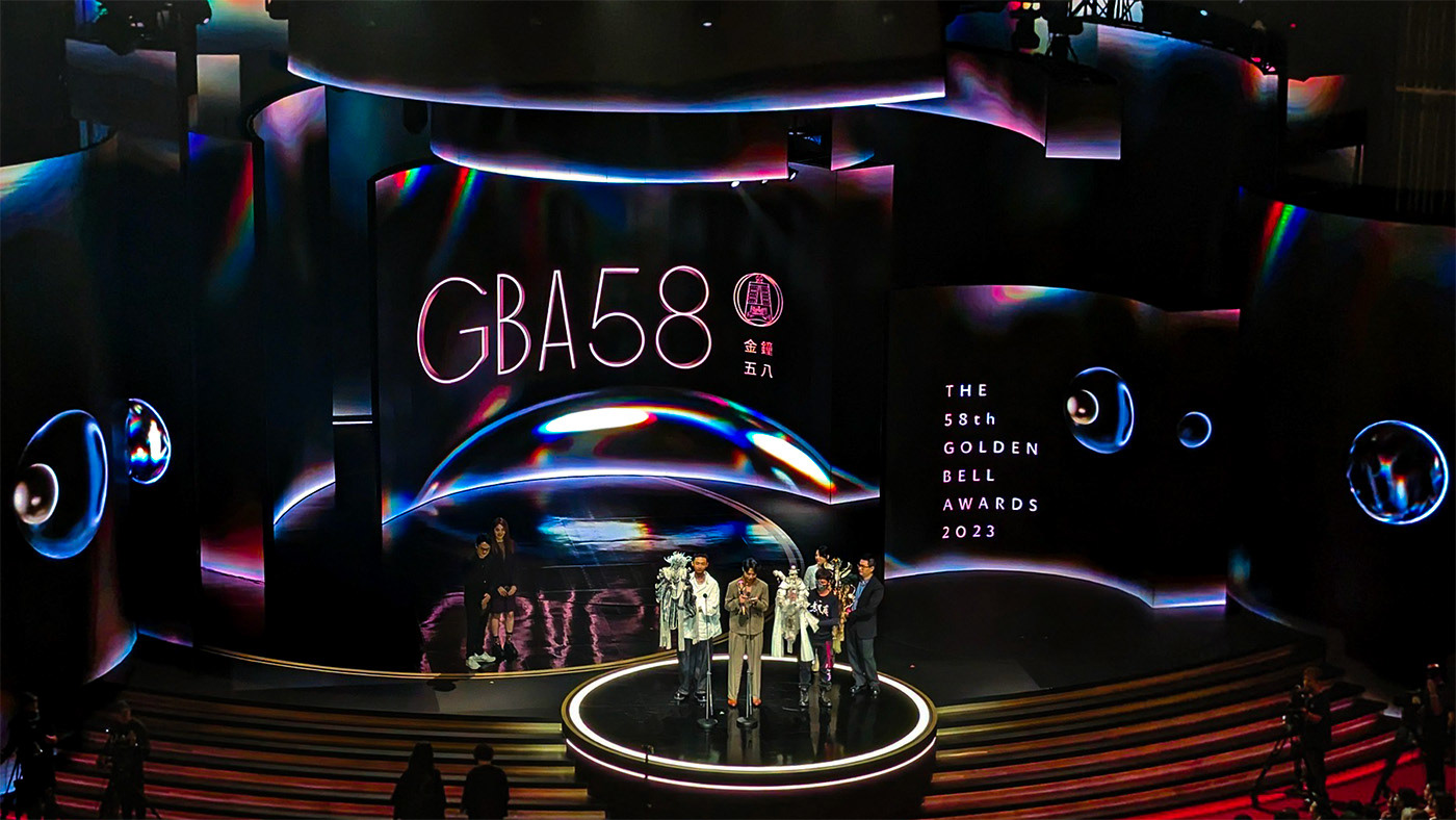
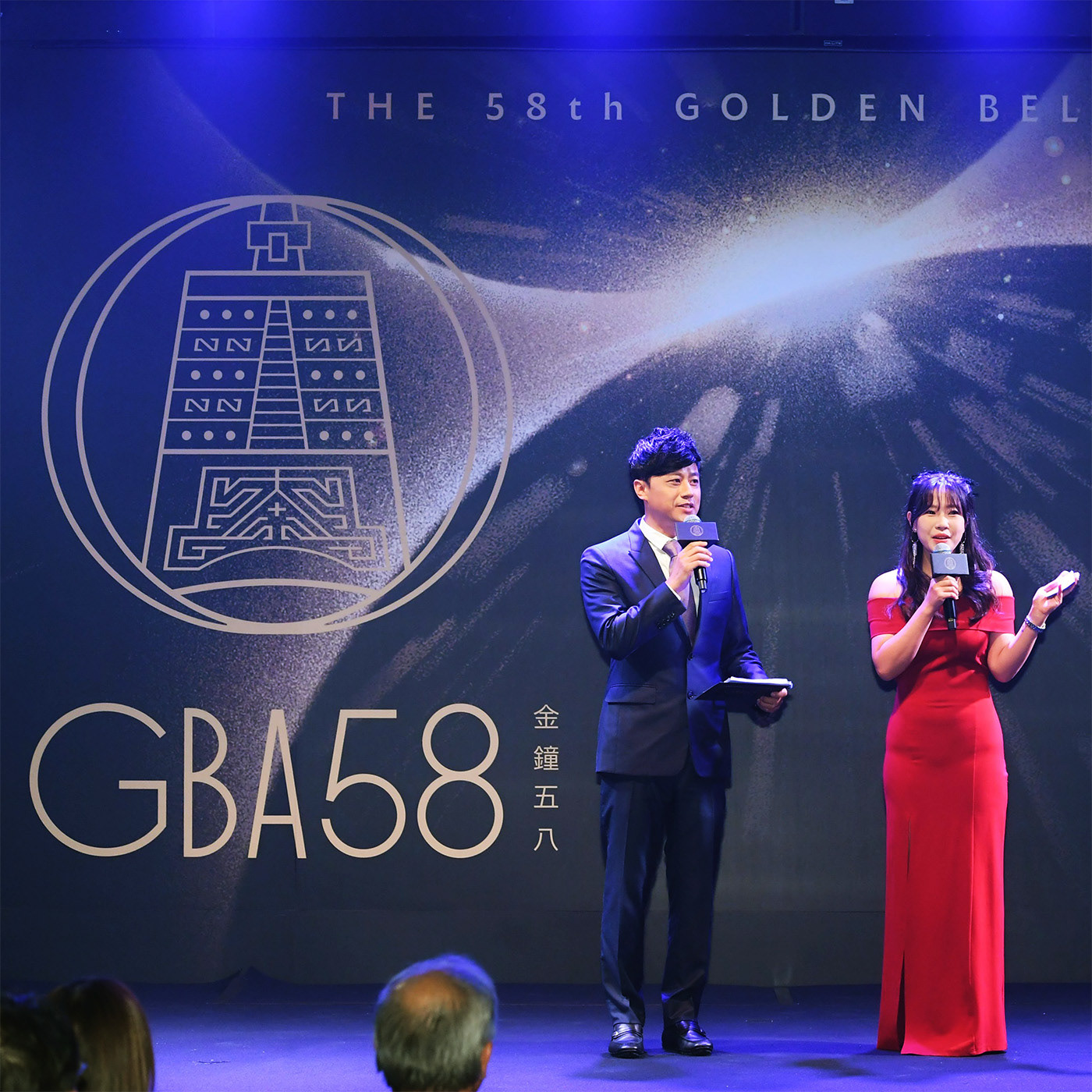
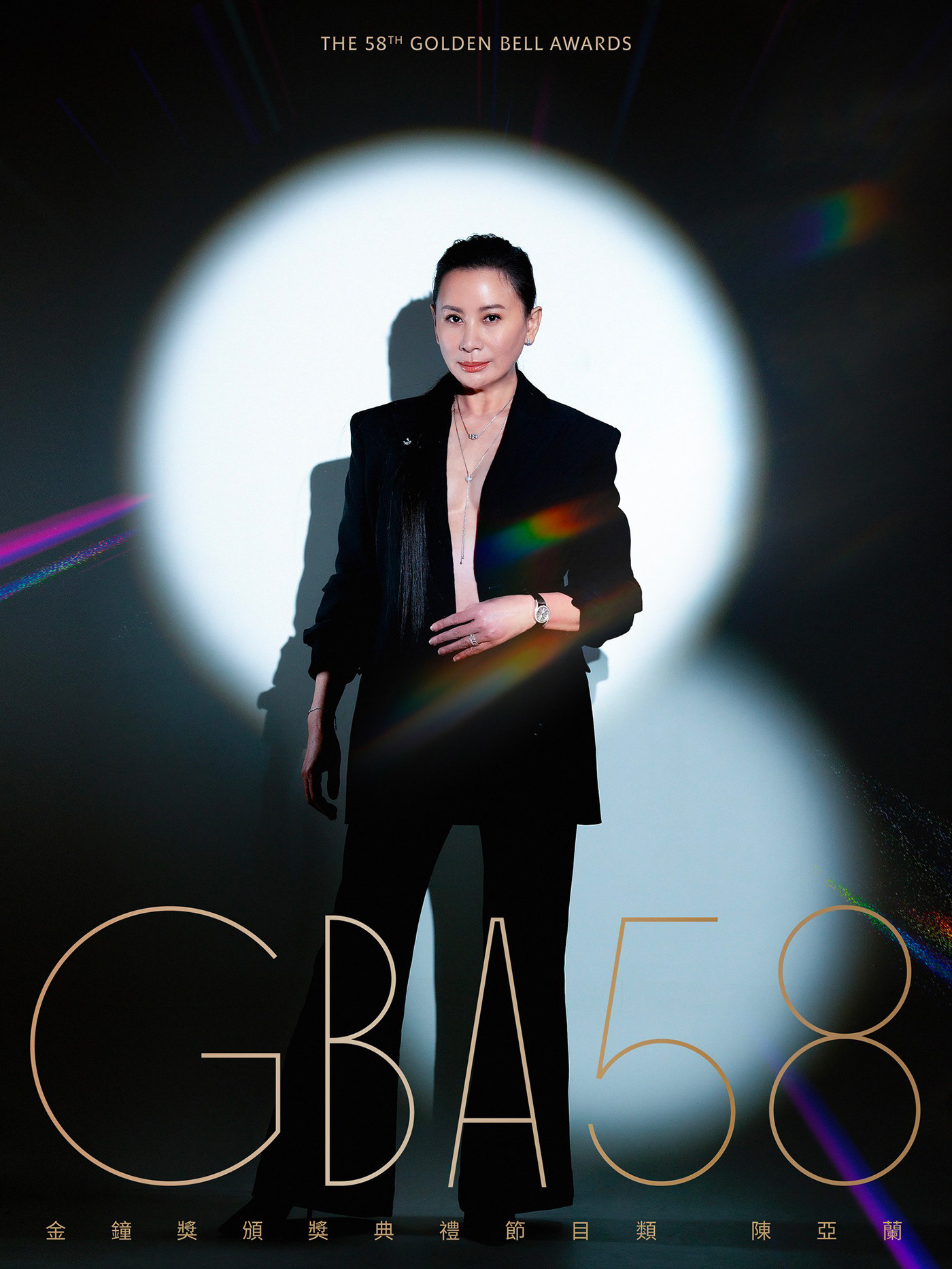
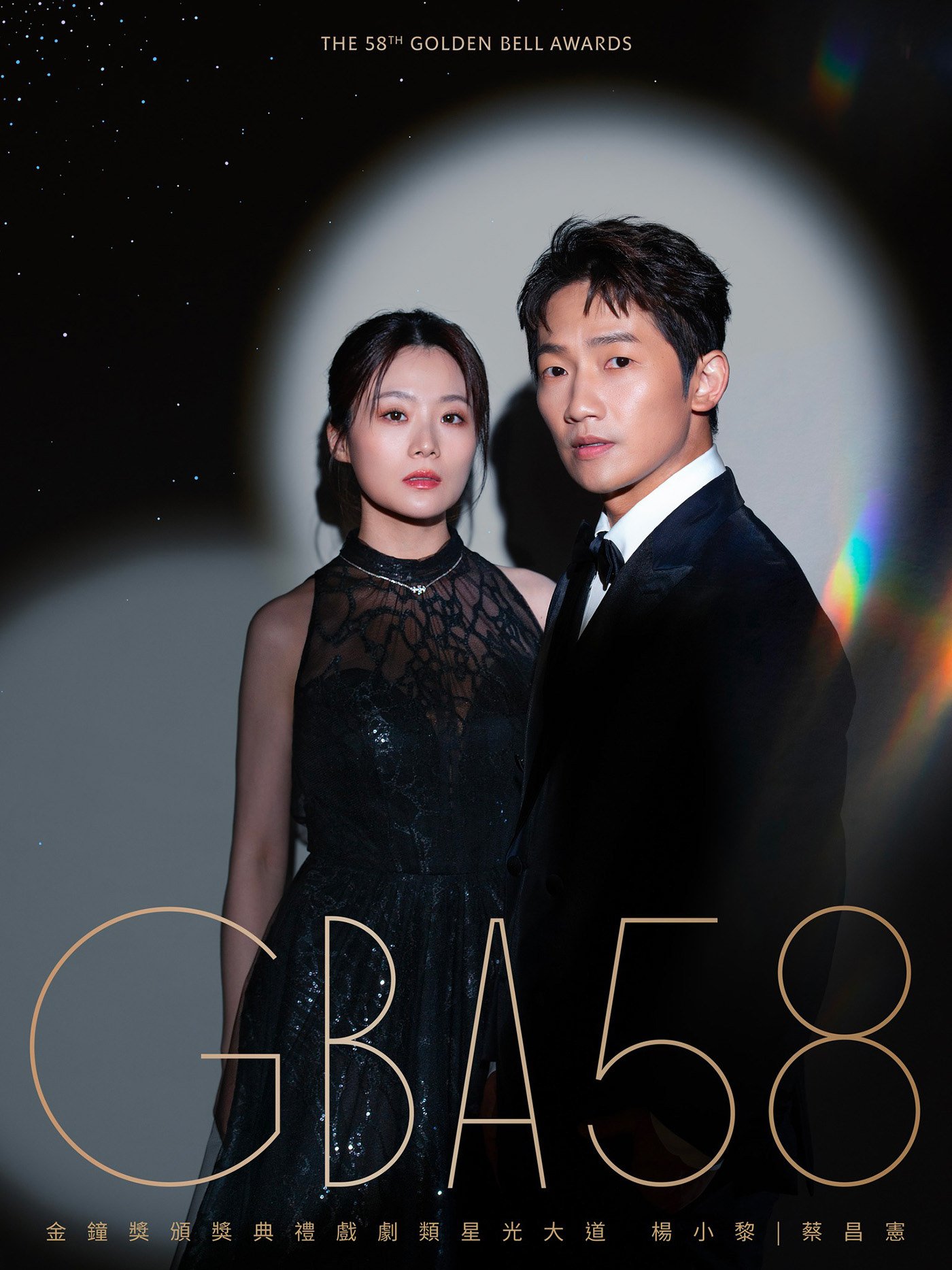
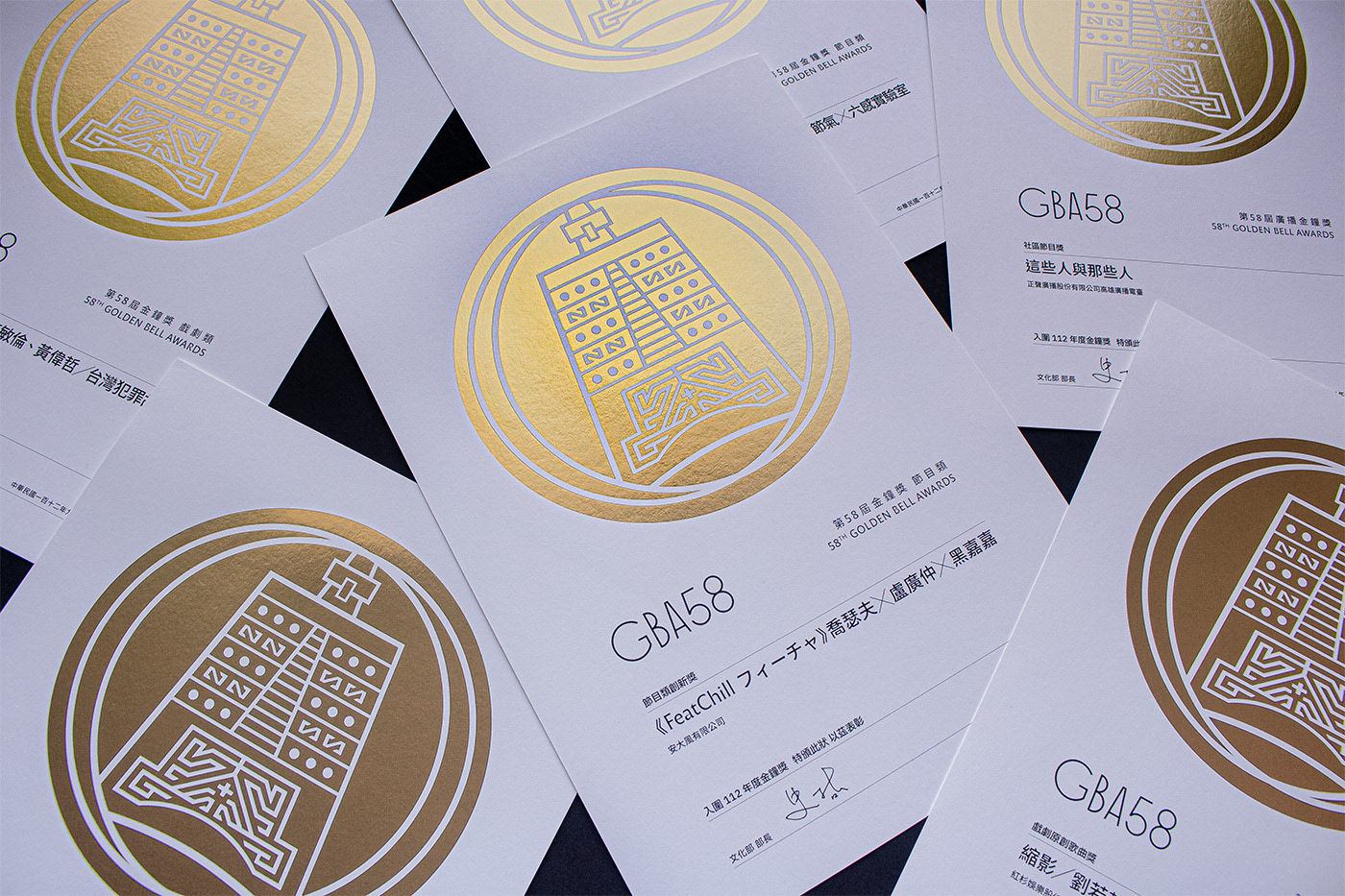
視覺敘事節奏鋪陳:以通用視覺營造碰撞前即將接觸的 Impack 氛圍為始;廣播視覺著重廣播傳訊特質,強調輻射發光仍具備的時代力量;節目視覺聚焦屬性的多元精彩與創意奔放;戲劇視覺則以群星熠熠,閃耀矚目;客制 GBA58 品牌標準字,根據 70 年代字型 Organda 繪製,帶有 Art Deco 時期簡單而華麗的美感、魅力奔放以及對改變和進步的信念。特色於 8、C、G、O、Q 有著完美的幾何正圓,其他字符則有著高挑優雅造型,形成趣味對比。設定不同字重以適用各情境的應用,如極細的 Hairline 線體,在等寬畫面時具備份量又避免厚重。印刷上四色與特色交錯使用、搭配紙張的特性,給予系統與區隔並重的應用表現。
___
The 58th Golden Bell Awards
Collision
Following the theme of the 57th Golden Bell Awards, "Flow," the external environment continues to evolve and shift, with streaming platforms flourishing, bringing more opportunities and uncertainties to the industry. The pandemic and wars persist, and the balance between ideals and reality, breakthroughs and sustainability, supply and demand, living and survival will accelerate and intensify, aligning more closely with the direction of people's hearts. Multidimensional collisions, adaptability, and grounding will be the next major challenges.
Visually, the basic form is a collision of two circles, capturing the explosive moment of impact through close-up shots. From 0 to 8, from nothing to infinity, from silence to the powerful burst of collision, boundaries are blurred and reversed, creating an eruption in the transition between old and new.
The visual narrative rhythm unfolds as follows: starting with a universal visual that creates the atmosphere of impending impact before the collision; the visual for broadcasting highlights the unique qualities of radio transmission, emphasizing the era's enduring radiating energy; program visuals focus on diversity, brilliance, and creative freedom; drama visuals showcase the dazzling stars in the spotlight.
A custom "GBA58" brand typeface was designed, based on the 1970s font "Organda," which carries the simple yet glamorous aesthetic of the Art Deco period, with bold charm and a belief in change and progress. The characters "8," "C," "G," "O," and "Q" are rendered as perfect geometric circles, while the other characters are tall and elegantly shaped, creating a playful contrast. Different font weights are set to suit various applications, such as the ultra-thin "Hairline" style, which holds visual weight on a uniform-width screen without appearing too heavy.
Coordination and Motion by AGI CHEN STUDIO
Photo Courtesy of Golden Bell Awards, Sanlih Entertainment Television