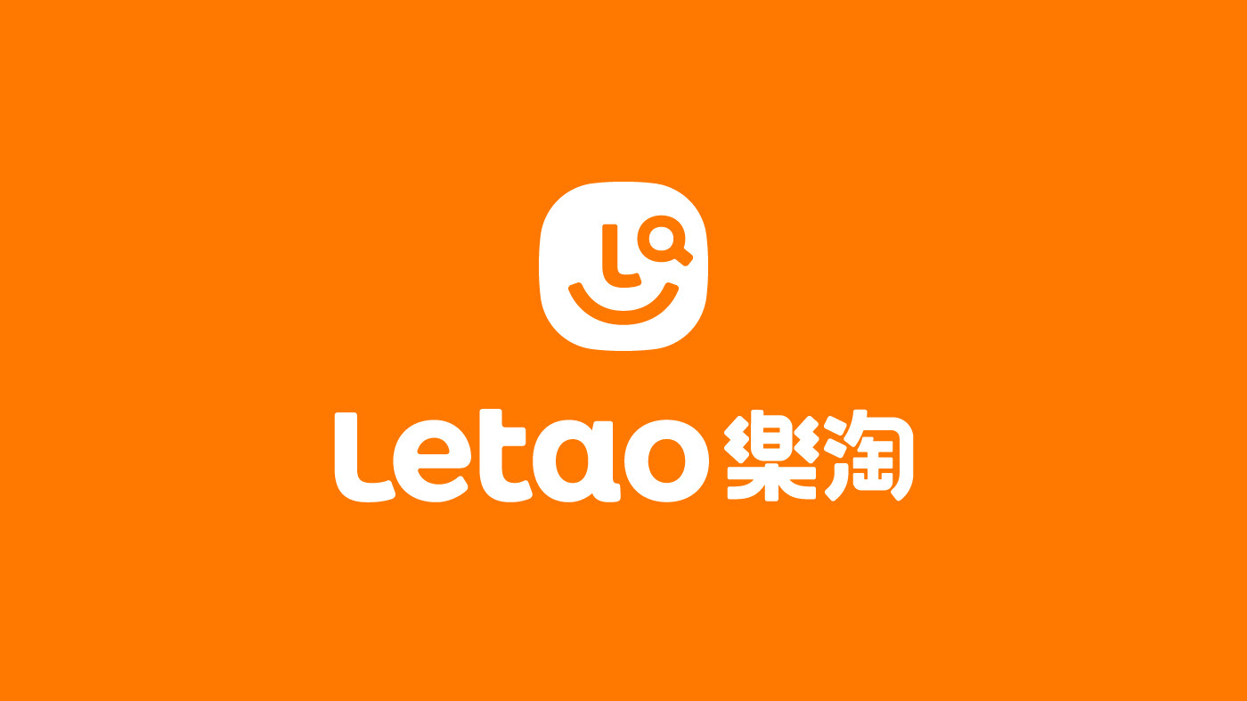


樂淘Letao品牌專案 - 創造尋寶的樂趣
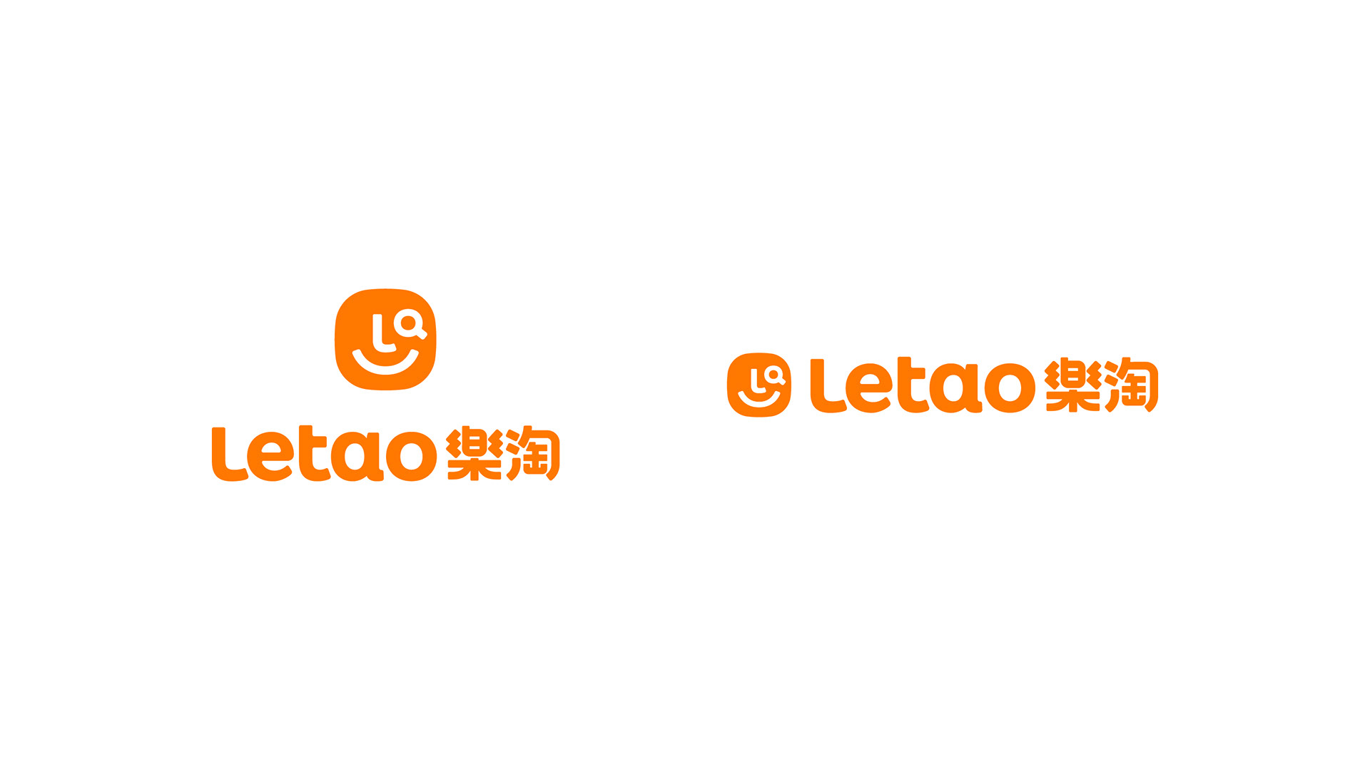
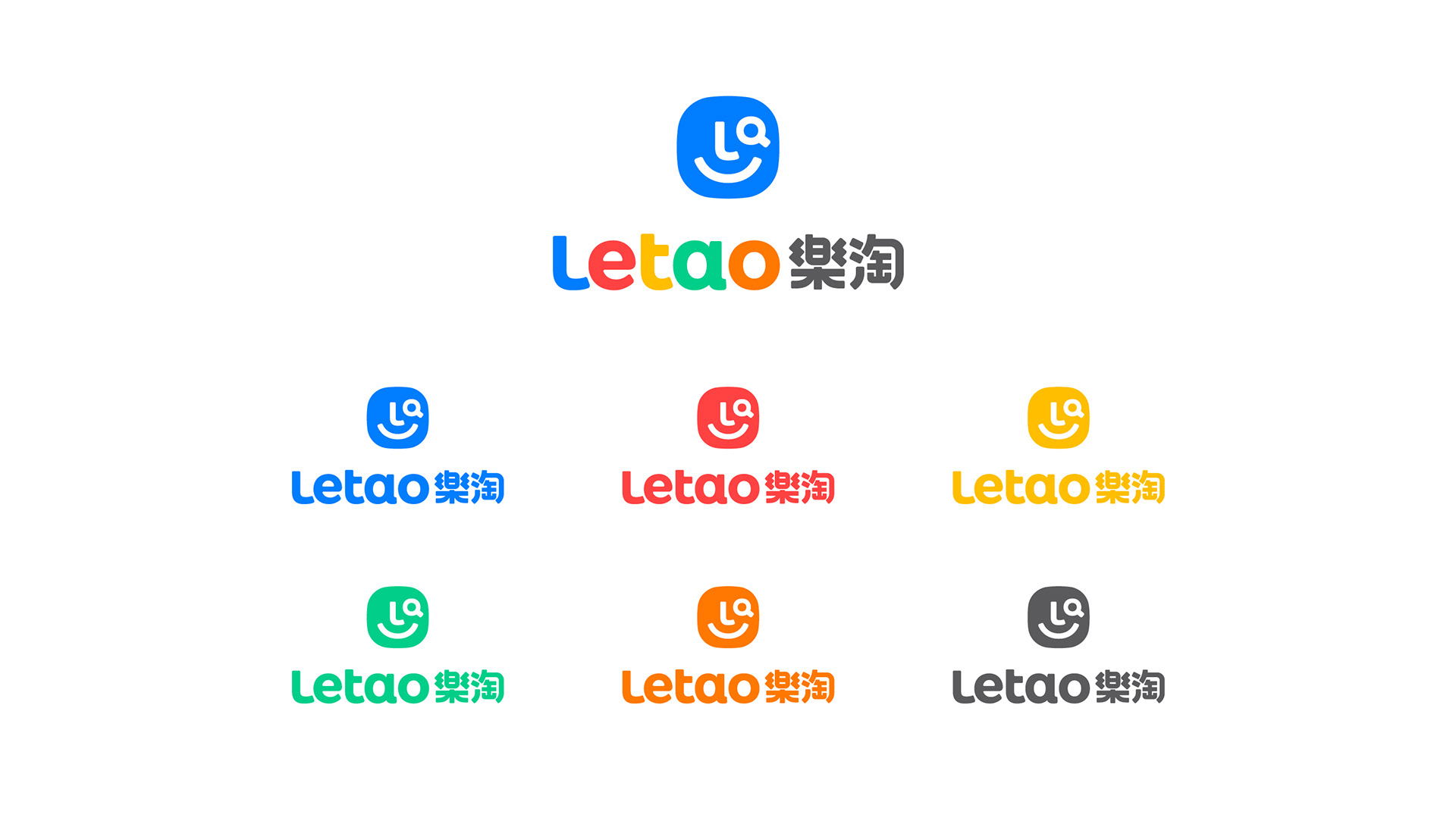
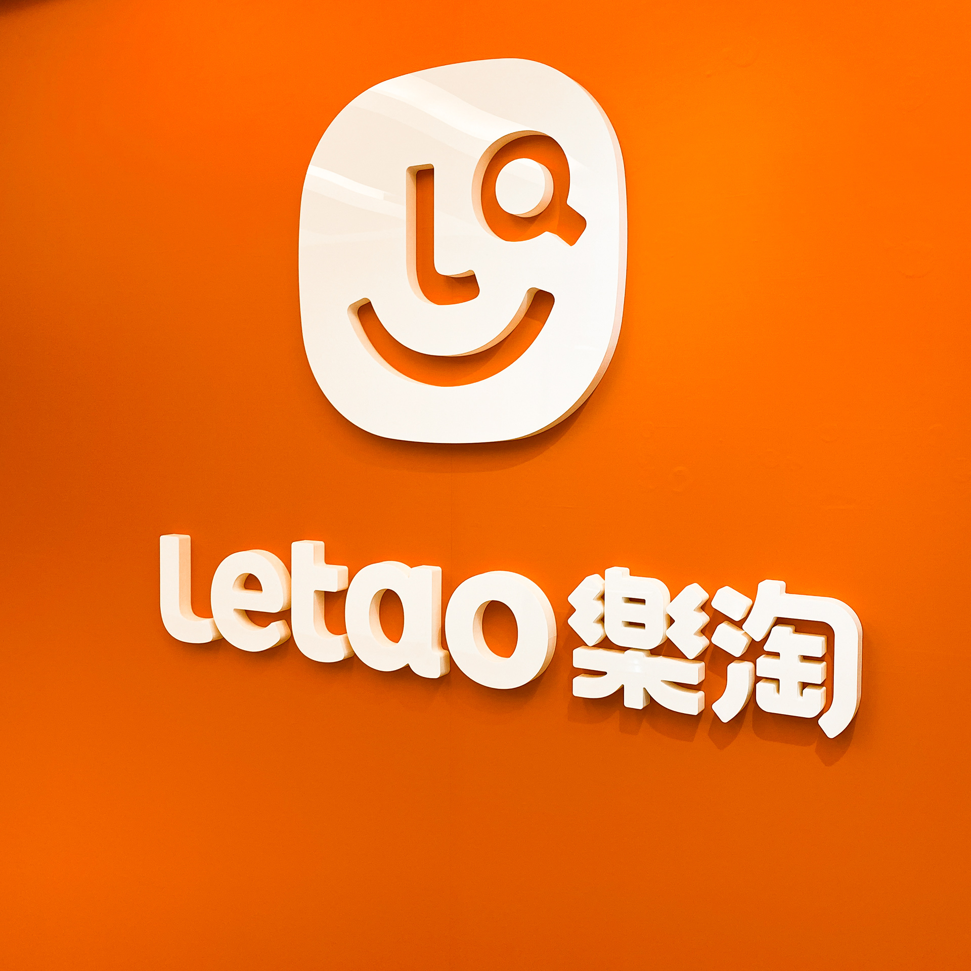
台灣代購平台 Letao,以字母 L 與 O 的造型結合放大鏡符號,象徵尋寶樂趣,展現『樂淘』探索世界好物的品牌精神。Logotype 採大小寫字體混搭,並搭配五色配色,呼應歐美線、日韓線等多元購物區隔,兼具趣味與親和力,讓跨境購物變得簡單、安全且便捷。
Letao Identity Design
One of the top cross-border Purchasing Agent in taiwan. The New logo was designed to emphasize the Joy of "Treasure Hunting". Drawing inspiration from the letter "O" and "L" in the logotype, combined with a magnifying glass symbol, it conveys the pleasure of treasure hunting at "Letao." The logotype incorporates a mix of uppercase and lowercase letters, along with multi-color palette, catering to the shopping preferences of different regions such as Europe, the United States, Japan, and Korea. Simultaneously, it aims to evoke a sense of fun and friendliness, emphasizing that cross-border shopping is simple, easy, and secure.